Make Your Mark

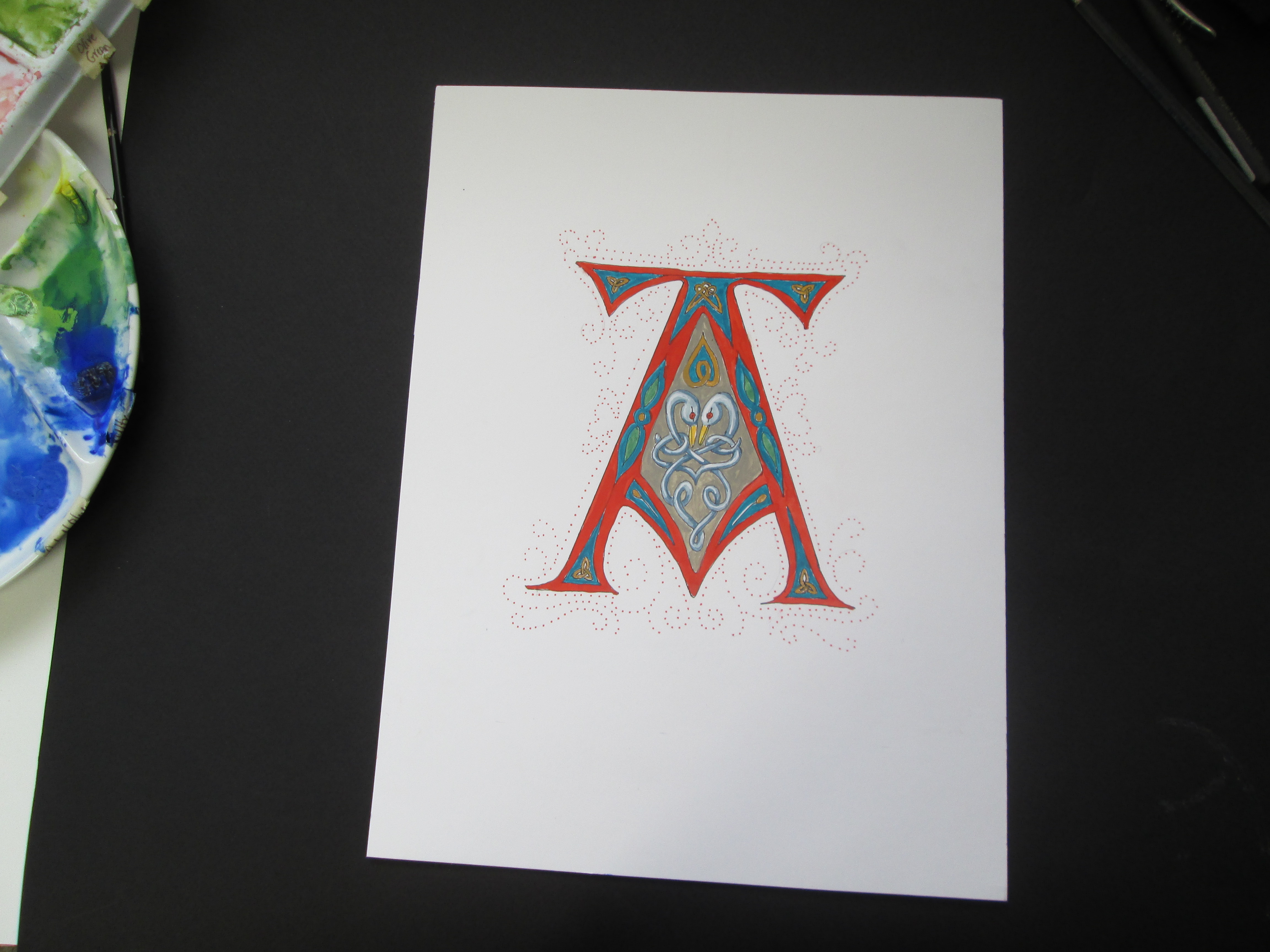
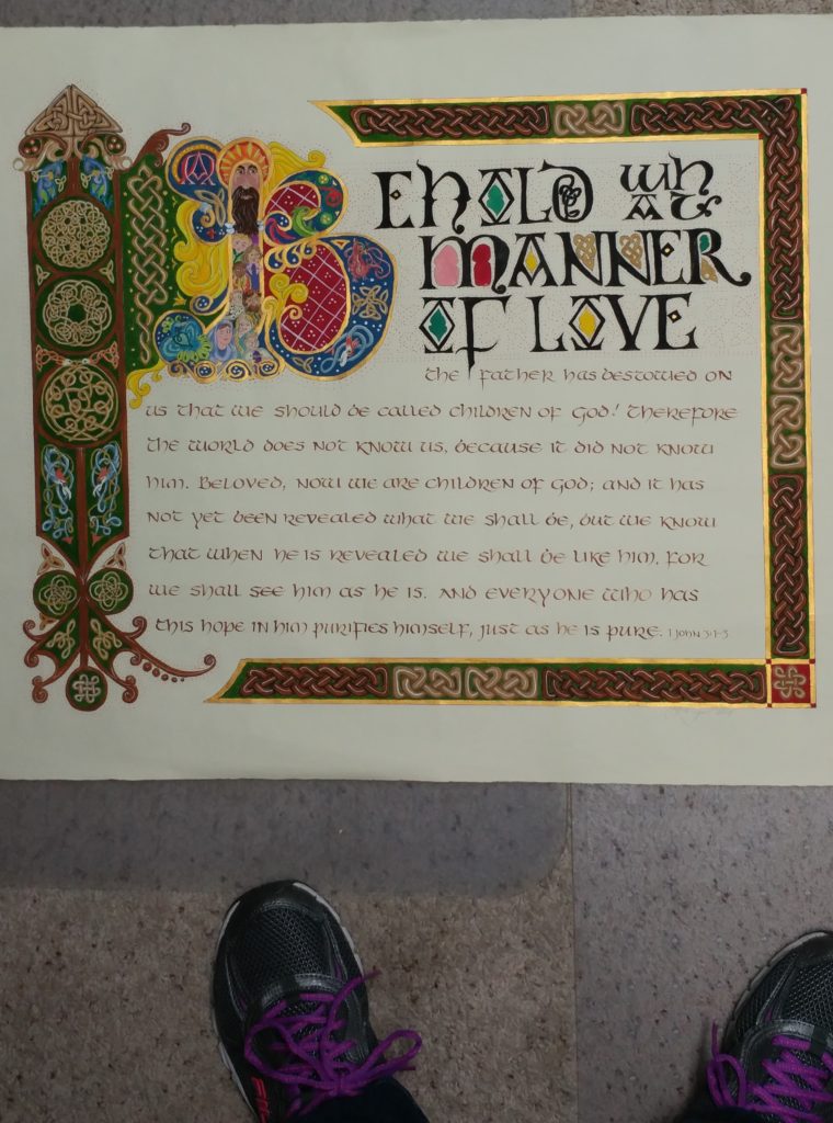
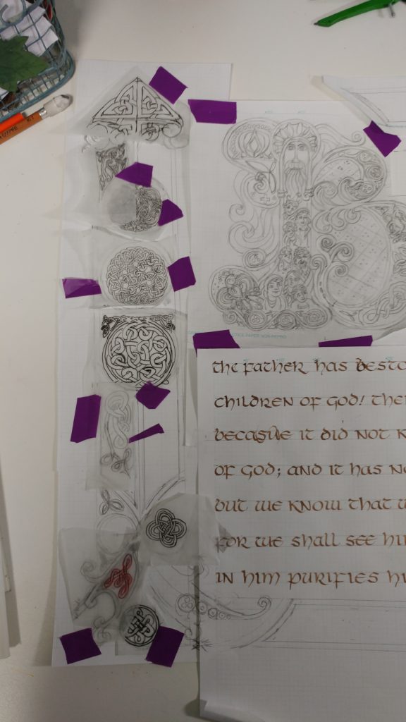
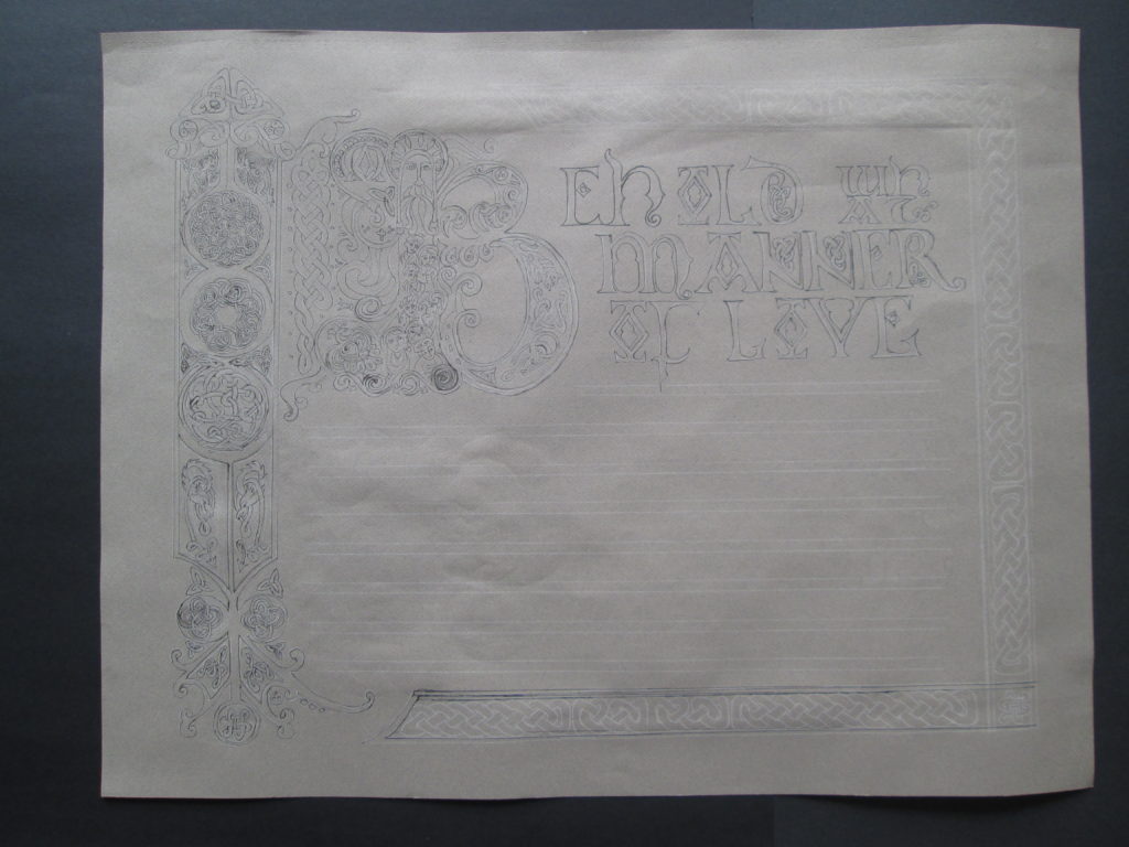
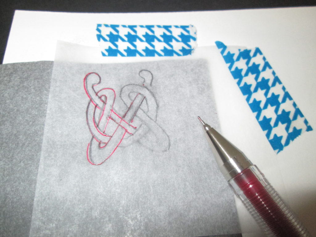
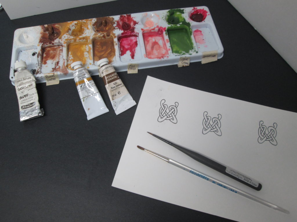
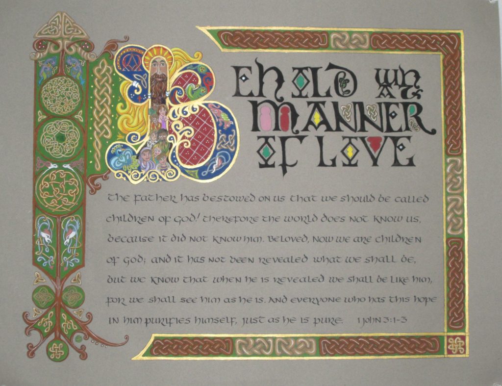
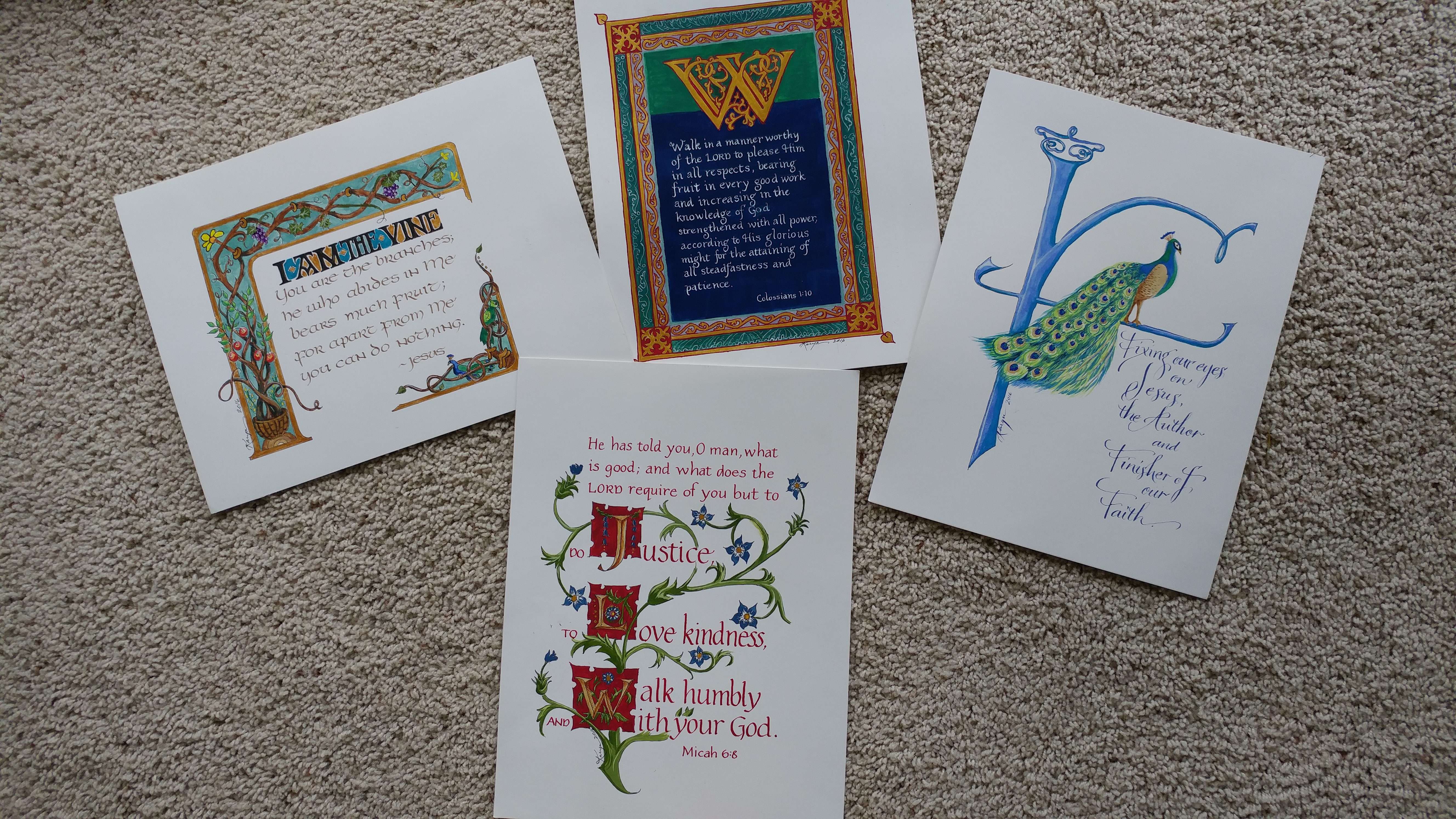
Learning a hand-written alphabet requires careful focus on each mark as it is made. The shape, direction, weight and placement of each mark is critical to the letterform carrying its intended meaning. I’ve just finished a lettering workshop where I spent 2 days learning the basics of a new-to-me alphabet. It is called “Bone” lettering because the strokes and shapes of the letters resemble a bone, being widened at each end. It required careful attention and lots of work to learn the new skill of twisting my pen as I made each mark to form the letters.

This intense scrutiny of mark-making stirred me to think and remember a conversation I had years ago. “Uncle Jerry” (my son-in-law’s uncle), along with his wife, had come to Central Oregon to visit us. During the drive back to Portland Airport he pointed out that all humans are “mark-makers.” Mark making is a distinct human activity that is one of the things which distinguish humans from all other living creatures. Jerry declared that with two simple strokes he could convey his entire cosmology. Can you determine what he believes by looking at the marks?


Think of it. We communicate our thoughts to other humans using our voices to form words. Those sounds can, and usually do, correlate to marks we make to record our thoughts in a more permanent fashion. As others look at those marks, the meaning we intended is conveyed to the reader of the marks. In ancient times, the marks would be pictorial as people used sticks burned to charcoal or minerals ground to powder to create images –marks- to tell others something of importance. The hieroglyphs of ancient Egyptians, the cuneiform wedges pressed into soft clay, the inky swirls of Sanskrit brush strokes all carry meaning from the minds of those who made the marks to those who read them then and now-even after millennia have passed. Whether the marks are pictorial or letter form, the maker of the mark is sharing abstract thoughts.

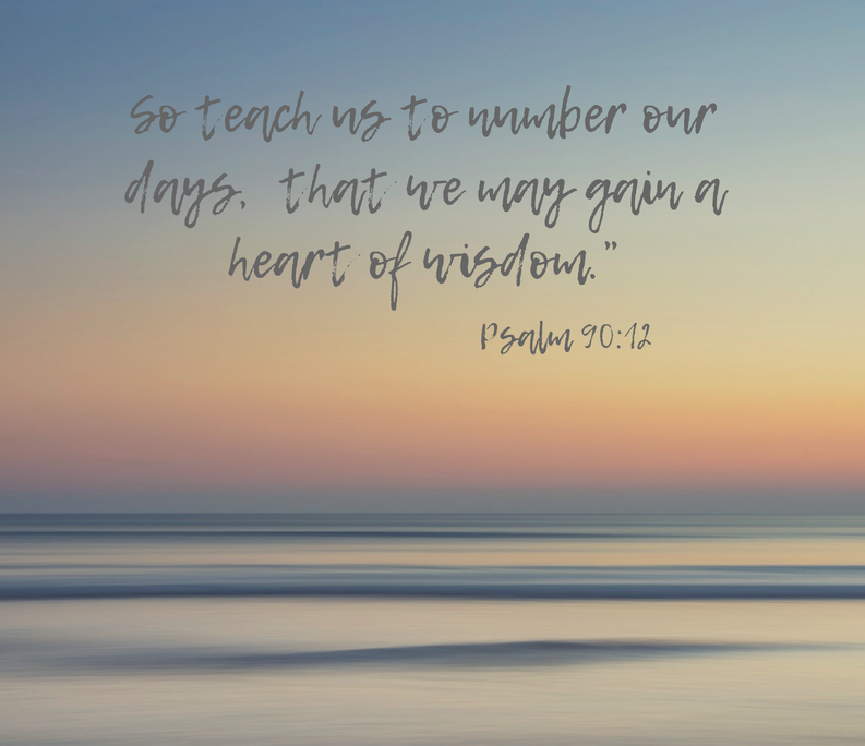
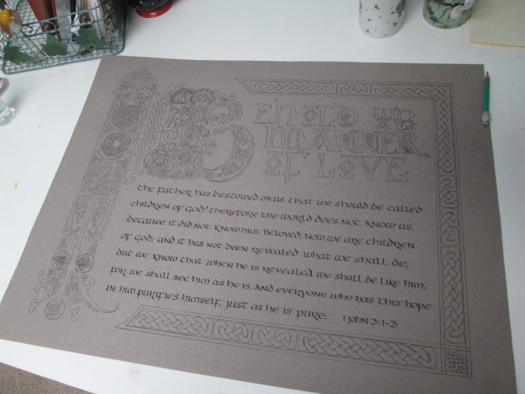
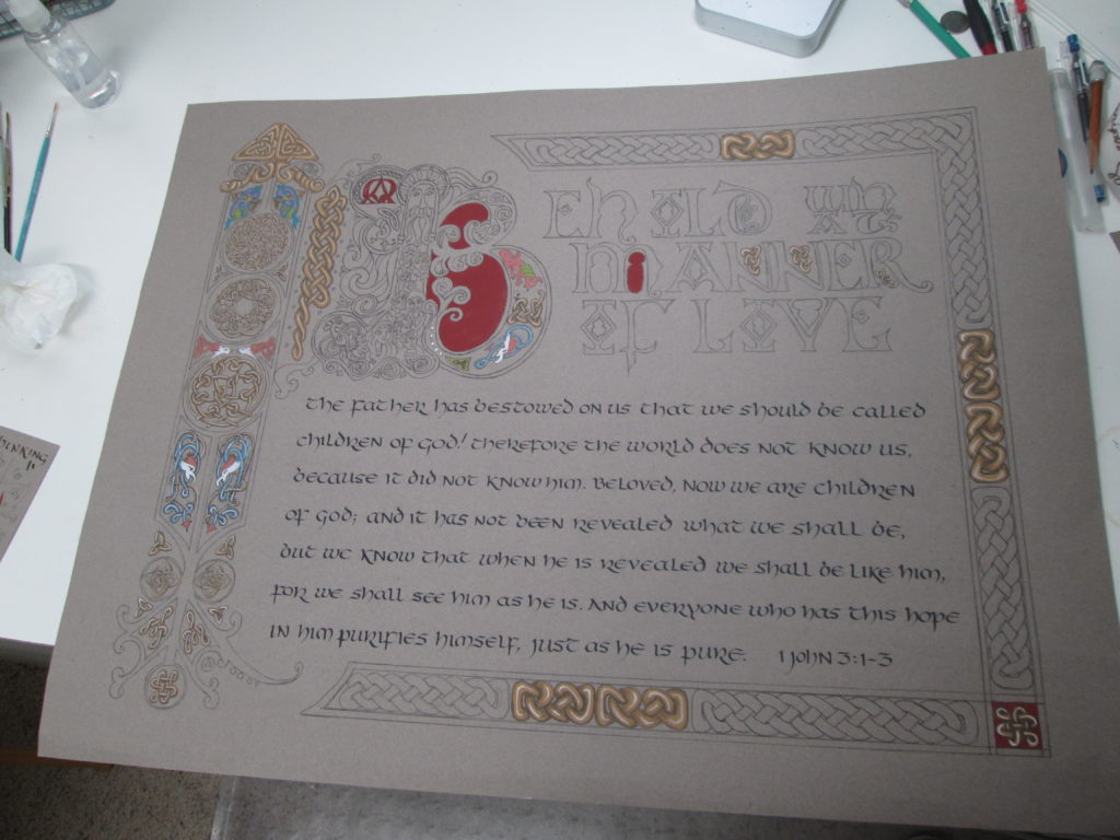
Consider these marks. Any guess as to their meaning?

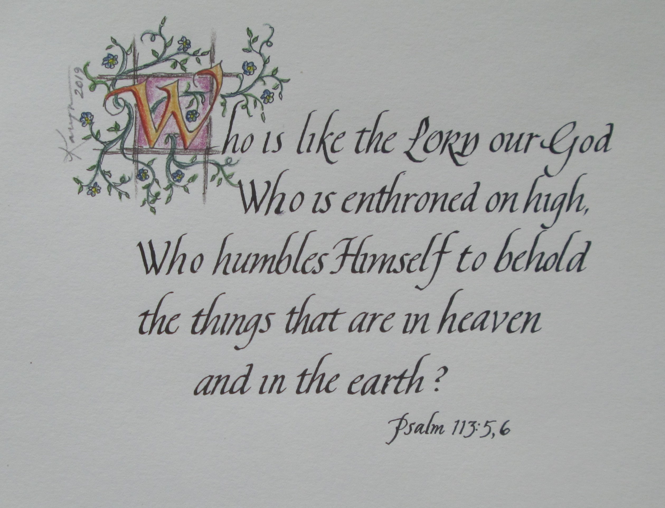
When I made the marks to form these words, you were able to read my marks and think what the writer of the Psalm nearly 4000 years ago thought and wrote. I was able to share what was in my mind by making marks on the paper and showing you the result. The words are ones that were in the mind of the Psalmist (probably King David) four millennia ago! And even more amazing is that the thoughts are actually the thoughts of God Himself, communicated to us—David, me and you and all other readers of this Scripture.


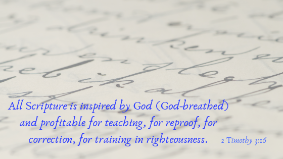
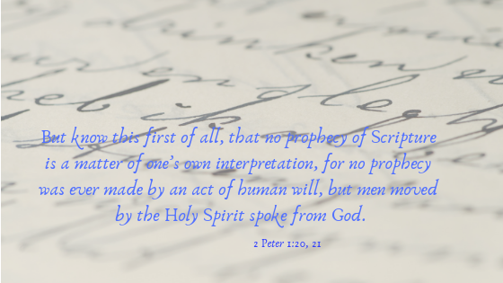
Because we are made in the image of God, we are beings who are able to communicate with one another. We can do this by forming and speaking words. But we can also make marks—write or draw—the thoughts of our minds and people yet unborn can and may be able to think and hear from us. God has given us His own thoughts. He actually wrote them with His finger when He delivered the tablets of the Law (the 10 Commandments) to Moses on Mt. Sinai. The Holy Spirit inspired men to write as He moved them, and thus God continued to direct the mark-making, meaning-giving, wonder of words.


Here we are, millennia after the marks were first made, able to read and know the mind of God. As we look at each mark on the page, whether on the lightweight page of a printed Bible or on the glowing screen of a phone, the meaning comes unmistakable over the ages. And if you like writing by hand as much as I do, you are able to make marks that put down those very words right there in front of yourself. God’s thoughts, your writing, and your heart’s thoughts all tied together. All because of marks!

QUESTION: Are you finding meaning in the marks on the pages of Scripture?

Painting Celtic Knot Work with Gouache

This week I am taking a break from overtly spiritual reflections and have prepared a video highlighting how I work on one of my illuminated letters. I am working on a set of all 26 letters of the alphabet and this letter “A” is my first. The video shows how I paint Celtic knot work and it gives you a bit of background in what my tools and materials are for painting in this ancient style.

I hope you will come along and watch as I paint on my Celtic letter “A”.

You can find this and other tutorial videos on my YouTube channel  (Karyn Jeffrey- The Designing Woman   https://www.youtube.com/channel/UC_J6vhzsxkCeAkwXs7PqTQw  )

QUESTION: Have you every painted in watercolor? Opaque watercolor? (gouache) Ever wanted to?


Drifting and Diligence

The summer is drawing to a close. I am drifting in the lazy warm days that seem so lethargic that it is easy to let them slip away with nothing accomplished. I am convinced that I ought to be making the most of my time and am squirming under the awareness that I need to get back to the diligence of days that are more focused and productive.

Summer days here have been hot and hazy with lots of smoke from wildfires throughout the West– this has been a perfect recipe for laziness and lethargy. Diligence is “out the window”!

I have begun praying for God’s help and the Holy Spirit brought this particular Scripture to mind. He is so faithful to work on my heart and my thinking. I love how He uses the Word that I have read in the past to work on me now. I’ve been asking for Him to get me off  “dead center” where I have been floundering and drifting. Isn’t this a wonderful spiritual “nudge”?!

                            “So teach us to number our days,  that we may gain a heart of wisdom.” Psalm 90:12.

As a consequence of the busy-ness of the past few months– social commitments, houseguests, garden and home projects– I have not spent much time with my art making. And certainly I have neglected writing for this blog.  So, here I am taking myself in hand and trying to pick up where I left off a few months ago.

I have begun practicing two basic alphabets- simple monoline pen practice on grid paper. This focus came about because this summer I was privileged to be the host home for world-famous calligrapher, Barry Morentz. Follow him on Instagram: barrymorentz. He was in my city to lead a calligraphy workshop. His teaching at the workshop and his encouragement as he kindly critiqued several pieces of my work have set me on a new path. He urged me to try my hand at re-doing the pieces he looked over.  He also asked me a probing question that really helped me focus. “Which alphabet or alphabets do I most want to master?” That made me realize I first want the ones that are the backbone of all the others. So I began by practicing two basic alphabets- the Roman and the Italic.

I am using graph paper and the “rules” that underlie the basic Roman alphabet to practice proportion. Barry also encouraged me to trace & copy the exemplar of work by Sheila Waters to get the physical feel of doing the italic alphabet right. I have begun doing this and WOW! What a help it is! I urge you to give it a try. Here’s how:

For the Roman alphabet, download this exemplar and practice on grid paper with a pencil and then a monoline (ballpoint, gel tip, etc) pen.

Roman Capital exemplar PDF file – click here!

If you want to focus on Italic calligraphy, photocopy an exemplar from a good calligraphy book, (I suggest Foundations of Calligraphy by Sheila Waters) use your light table as you trace, first with pencil or ballpoint pen, to get the shape and slant in your mind. Then move to using an edged pen of the same size as the exemplar. When you begin using an edged pen and ink be sure to use practice paper that won’t bleed through to your exemplar! I suggest HP Paper, Premium Choice Laserjet Paper Poly Wrap, 32lb, 8.5 x 11, Letter, 500 Sheets / 1 Ream Made In The USA — available on Amazon. This paper is a great basic “drawing” paper that behaves well with ink and works well with markers and light watercolors with minimum buckling and bleed-through.

All this tracing and copying helps you recognize and put into muscle memory the counter shapes, pen angle, slant, spacing and rhythm of the alphabet. This process can be used with any alphabet you want to master.

So, now that I have spent a bit of time doing all this, I re-did this little piece of calligraphy that sits on my bathroom counter. What do you think of the improvements in my Italic lettering?  I can see several things I still want to do better, but it is very encouraging to see improvement–however small.  (I’m not crazy about the colors used in the new version and so think a third shot will happen.)

before and after
The before version is on the left and the one on the right is my newest effort

I also have been practicing the Roman alphabet and so tried this piece that combines the two styles of lettering. The Latin Phrase, “Theatrum Gloriae” was used by John Calvin in his famous Institutes of Christian Religion when he was commenting on Psalm 19. The phrase roughly translated means ‘Glorious Theater’ and is a metaphor for the immense beauty of the creation.

Theatrum Gloriae
I used a scrap of drawing paper and lettered the Latin phrase with graphite pencil and the Psalm with pen and ink.

Leave me a comment—I’d love to hear your response. And keep on the lookout for the re-do’s of the bigger pieces I mentioned earlier. “Coming Soon”!

Mistakes I have made- An Illumination – troubles and all– from start to finish

I have been working on a large calligraphy piece for the past several months. The process has been a rocky road with more trouble than usual. The size of the project seemed to magnify the mistakes and deepen my frustration. Let me take you on a journey of through a lot of calligraphy mistakes. I hope it inspires you to persevere when a project of yours starts to “go south.”

I began painting this piece before Christmas and was quite pleased with my effort until I laid it out to photograph it. ARHGH! In all the weeks of work I had not noticed that the band of design on the left is tilted—crooked.

first version of behold
My first try – so much work- such big mistakes! ARGH!!

The plan for framing it for sale was out. The crookedness would be so obvious that there was no way I could retrieve it. I laid it aside to enjoy the whirl of the holiday seasons with some lessons learned.

Lesson 1: Check and double check initial drawing for accuracy before adding any permanent medium.

Lesson 2: Breathe. Back away slowly.

January rolled around and I was ready to tackle a new version. This time I decided to use a darker paper. This would need a white transfer paper, I thought, to put the cartoon down for inking.

I placed and taped down the drawing which was a mish-mash on the tracing paper and grid paper I had used before. I was careful to be sure they were “square with the world” this time and so spent a few hours transferring the drawing.

taped down to trace

To transfer the drawing down I used a red ink fine-line G-Tec-C4  pen 0.4MM   https://www.amazon.com/Pilot-G-Tec-C4-Assorted-Colors-Rollerball   to assure a clear, even line on the dark paper and a colored line I could see on the cartoon as I made the tracing.

g-tec pens

When I removed the tracing papers and transfer paper, I was pleased that I could easily see the white drawing all ready for my ink outline. “Onward!!”

I took out my favorite waterproof fine-line pen- Faber-Castell Pitt pigmented drawing ink pen (available in various widths) https://www.amazon.com/Pigmented-Drawing-Artist-Widths-Castell/ and started on the inking.

pitt pens

The process wasn’t smooth sailing because the ink did not like the waxiness of the white transfer lines. Grrrr. >:{  I had failed to test that aspect before beginning the tracing process. But undeterred, I kept inking. But then, as I began my way up the left band (oh! That left band!!) I realized I had a HUGE problem. During the tracing process, the drawings had shifted nearly a quarter inch. There was no way to bridge the skewed design areas.

bad tracing

I stopped. Nearly cried in frustration. And then followed my advice of Lesson 2. “Breathe!”  And “Back away slowly.”

Lesson 3: see Lesson 1.

A few days later, after a lot of deep breathing and even deeper thinking, I decided to make one large tracing of the pieces I had used before. Then I turned the paper over, used a graphite transfer paper and securely attached that single tracing.

While I was making the single tracing, I did several design changes and most of all made absolutely certain that it was square with the edges. The entire design is inspired by pages from the Book of Kells and several of the Celtic knots are taken from George Bain’s work on historic Celtic designs. I also included some knots I created myself. This knot-making aspect of illuminating is still a “work-in-progress” for me!

I checked and rechecked my drawing. I checked and rechecked my “taping-down” and before I even began I tested the graphite paper to be sure it wouldn’t give me trouble in putting ink over the traced lines. And after all this checking and several hours of tracing, HOORAY!! A tracing ready to ink and then paint!

I paint primarily with gouache watercolor [say: guh-WASH]. It is opaque rather than the transparent watercolor most people associate with watercolor painting. My brushes are small and made of sable- sizes 1, 2 and 3 rounds and a size 00 liner brush. Check this website for this type of tool and supply.  https://www.dickblick.com/

Because gouache paint is opaque the method of application to achieve highlights and shadows is different than working with more familiar transparent watercolor. Gouache requires flat areas of color that hide the paper beneath. Then additional color is added to create 3-dimensonality.

highlighting in gouache
Left to right: 1: a flat area 2: shadows added 3: highlights added

I used Fine-Tec metallic watercolor for the final bit of color in the borders and around the versal “B.”

I spent many hours painting while listening to my audio book. It is such a joy to be in my studio- a quiet and happy place!

tracing stuff
tracing down using tracing paper and a G-tec fine line colored pen to see where I’ve been.
gouache and brush
One of my palettes with gouache paints (notice 3 different brands- all good) and types of brushes I use.
a proper tracing
Inking is finished and now for adding color
painting in progress
Color in progress. Notice red area inside the B doesn’t have the white “diapering” design it will have when finished.
final Behold what
Final work. – “square with the world, design problems worked out. Compare with first version which was on lighter paper. The same colors are used in both, but the darker ground makes it seem different. Interesting!

At last, it was done. If you are interested in purchasing this unframed piece, check my store.

What do you think?

Thanks for stopping by and please leave a comment.

Creative Juices Flowing

Here is where my artistic juices have been flowing lately. I’ve spent the past several days creating in this most inspirational space. Did you notice that it is the same color as my new bedroom?

Here she takes a nervous gulp and blurts out:

studio in some semblance of order- thankfully ink smudges and dog fur not visible

“I am about to launch a serious ‘social media campaign.’ ”

This is definitely tame by the standard of many younger folks but for a “mature” woman like myself it feels like a leap into a galaxy far, far away! So here is what is planned:  I am preparing to begin uploading pics to Instagram and making a bigger presence on Face Book and be more intentional and regular in posting on my blog.

these designs will be cards for sale soon. Planning for the Studio Art Tour in September for sure

I am preparing for the Art Tour in September and so have created 4 designs for 5” x 7” greeting cards. Will be taking them to my art photographer guy today. Look for ways to order them from me sometime soon. Also planning to get a coloring book made from the black and white line drawings of the letters in my book. Busy, busy, busy. But, oh, does it feel wonderful to be back in my studio making art!

So, hop on over to my book website  –  lifeinlettersbook.com (order a book while you are there!), check me out on Instagram – (karynjeffrey) (Whoo-hoo! This is new!) or find me on Face BookKaryn Jeffrey- The Designing Woman.

my book: Life In Letters- A Christian Young Person's Guide to Virtue, Integrity and Peace
my book: Life In Letters- A Christian Young Person’s Guide to Virtue, Integrity and Peace

I’ve put an RSS feed URL here so you can get notified regularly when I post something new. I am hoping to post at least once a week and maybe add a picture of current art work on a different day.

Thanks for stopping by!  Please leave a comment– it would help to know who is looking.


A Sample Page- “Give”

viewifle_lowres_give

This is the text that faces the image. It is intended to help a parent discuss the concept with his child. I hope this gives the idea of how the it will look.

GIVE
Read Mark 12:41-44, 2 Corinthians 9:6-11.
What did Jesus mean that she gave more than everyone else? What do we have to give to Jesus? Children usually don’t have independent income so discuss actions that can be gifts to others and thus to Jesus. What can you give to show others you love Jesus? Running errands for a busy parent or neighbor, cheerfully helping with chores, talking with an elderly family member, doing the best job possible on any project.
Read Ephesians 2:8-10.
Discuss and clarify that giving to others, or giving money to church or charity does not earn our salvation. We display our gratitude to God for His gift to us by giving generously to others. Discuss the Gospel truth of Jesus’ gift of life for us.

Salting Their Oats

Have you ever wondered what the saying, “salting the oats” means? If you have been around horses, you know they are obstinate. Given their size, people aren’t able to physically force horses to do their bidding, but must rely on training and techniques that gain the desired results. Sometimes a horse needs to drink water to be ready for work that Rancher Man knows is coming. But, being a “dumb animal” it has no desire to drink just then. Rancher Man has a wise method of encouraging his equine partner to drink the water he needs. He salts the oats the horse is eager to eat. Aha! Salt creates thirst and now, with a full belly and well hydrated the horse and Rancher Man are ready for the day’s work. 4540643316_ee9759e11c_o
We want our children to know and love Jesus, but are not sure how to stir up that desire in them. May I suggest one method to help you lead your little ones to the Living Water and experience the joy of their drinking deeply?

I’ve recently returned from visits with my eight grandchildren and their parents. My son’s family has begun a valuable practice of daily hearing Daddy read a chapter of the Bible after dinner, before anyone is dismissed from the table. This simple method of intentional “oat salting” could easily be adapted by most families. Let me give you a picture of what this looked like.
While we visited, on two successive evenings Daddy read from I Samuel (Chapters 5 and 6) about the capture of the Ark of the Covenant by the Philistines.

To recap the story for you: When the Ark is put in the temple of the false god, Dagon, God causes the Philistines’ beloved god to fall on its face and after a second fall which resulted in the statue’s dismemberment, the residents of Ashdod are distraught. Their panic escalates when there is an outbreak of tumors all through the land. To try to end their troubles they rid themselves of the Ark by placing it on a cart drawn by two cows which have never been yoked for pulling before. Their calves are locked up away from them and the Philistines watch to see where the cart will go. Its supernaturally direct route to the land of God’s people sends the clear message that they have tangled with the one True God.

After reading the chapter, Daddy asked a few simple questions to the children and gave some plain explanations of Philistine idolatry helped them understand the significance of the idol’s “face plants” at the hand of Almighty God. The short reading and talking session ended with a suspense building question: “I wonder what the Philistines will do with this troublesome Ark of the Covenant?”
Night two was started with a short re-cap of the previous night’s reading. After the next chapter was read, a discussion (primarily between adults and older children) ensued about cows and calves, the dynamic of a cow finding a nursing calf, and what a yoke is and how an animal would ordinarily react at the first use of it. All of this led to a clear awareness of the supernatural intervention of the True God.

It is wonderful that this family is hearing God’s Word—unadorned—each day. It only takes a few minutes and the questions and talk that follow help each child learn the skills of processing what has been read and heard. Deeper conversation began between the adults and older children and although the younger ones probably didn’t understand much of the dialogue, they are being shown a model of spiritual fellowship around Scripture. This “salting the oats” creates a thirst for the Living Water and will develop spiritual depth in children who are not only versed in Bible stories, but trained in the truths they are meant to convey.

What will you do to intentionally help your children love and understand the Word of God?

Photo attribution:

Photo by Andrew Wilkinson, no alterations

https://creativecommons.org/licenses/by-sa/2.0/

www.flickr.com/photos/andrew_j_w/