I have been working on a large calligraphy piece for the past several months. The process has been a rocky road with more trouble than usual. The size of the project seemed to magnify the mistakes and deepen my frustration. Let me take you on a journey of through a lot of calligraphy mistakes. I hope it inspires you to persevere when a project of yours starts to “go south.”
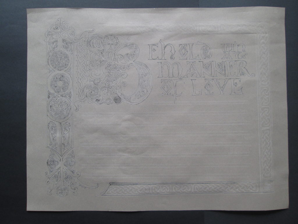
I began painting this piece before Christmas and was quite pleased with my effort until I laid it out to photograph it. ARHGH! In all the weeks of work I had not noticed that the band of design on the left is tilted—crooked.
The plan for framing it for sale was out. The crookedness would be so obvious that there was no way I could retrieve it. I laid it aside to enjoy the whirl of the holiday seasons with some lessons learned.
Lesson 1: Check and double check initial drawing for accuracy before adding any permanent medium.
Lesson 2: Breathe. Back away slowly.
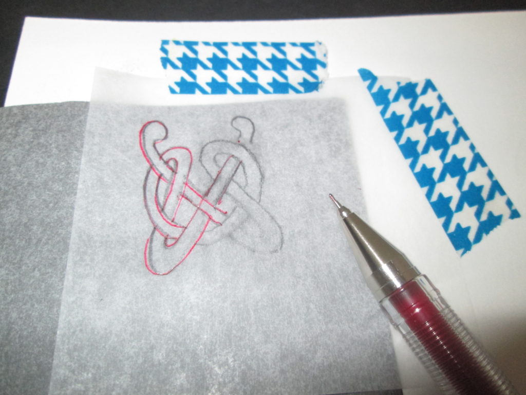
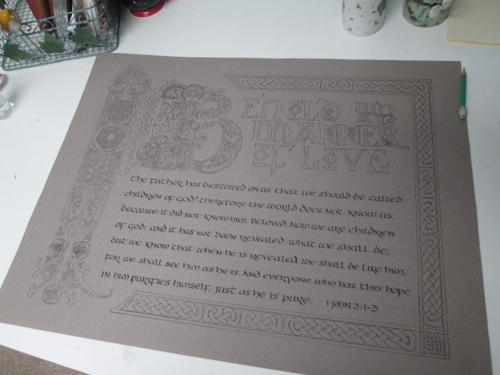
January rolled around and I was ready to tackle a new version. This time I decided to use a darker paper. This would need a white transfer paper, I thought, to put the cartoon down for inking.
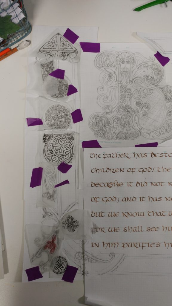
I placed and taped down the drawing which was a mish-mash on the tracing paper and grid paper I had used before. I was careful to be sure they were “square with the world” this time and so spent a few hours transferring the drawing.
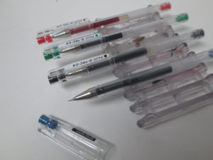
To transfer the drawing down I used a red ink fine-line G-Tec-C4 pen 0.4MM https://www.amazon.com/Pilot-G-Tec-C4-Assorted-Colors-Rollerball to assure a clear, even line on the dark paper and a colored line I could see on the cartoon as I made the tracing.
When I removed the tracing papers and transfer paper, I was pleased that I could easily see the white drawing all ready for my ink outline. “Onward!!”
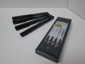
I took out my favorite waterproof fine-line pen- Faber-Castell Pitt pigmented drawing ink pen (available in various widths) https://www.amazon.com/Pigmented-Drawing-Artist-Widths-Castell/ and started on the inking.
The process wasn’t smooth sailing because the ink did not like the waxiness of the white transfer lines. Grrrr. >:{ I had failed to test that aspect before beginning the tracing process. But undeterred, I kept inking. But then, as I began my way up the left band (oh! That left band!!) I realized I had a HUGE problem. During the tracing process, the drawings had shifted nearly a quarter inch. There was no way to bridge the skewed design areas.
I stopped. Nearly cried in frustration. And then followed my advice of Lesson 2. “Breathe!” And “Back away slowly.”
Lesson 3: see Lesson 1.
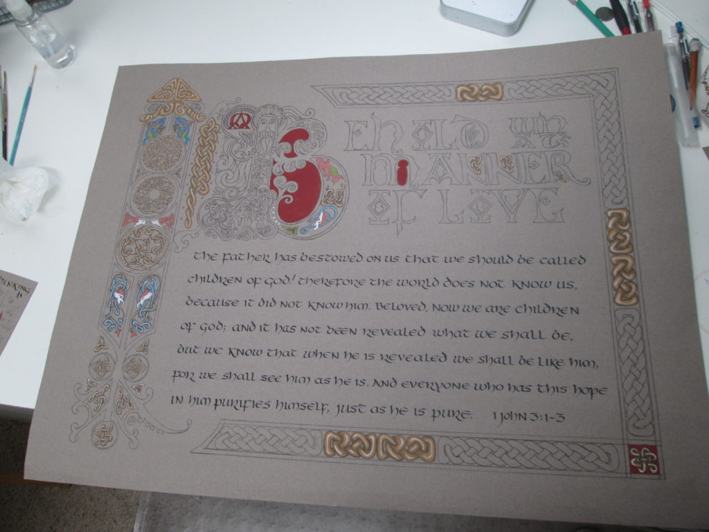
A few days later, after a lot of deep breathing and even deeper thinking, I decided to make one large tracing of the pieces I had used before. Then I turned the paper over, used a graphite transfer paper and securely attached that single tracing.
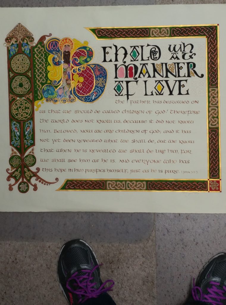
While I was making the single tracing, I did several design changes and most of all made absolutely certain that it was square with the edges. The entire design is inspired by pages from the Book of Kells and several of the Celtic knots are taken from George Bain’s work on historic Celtic designs. I also included some knots I created myself. This knot-making aspect of illuminating is still a “work-in-progress” for me!
I checked and rechecked my drawing. I checked and rechecked my “taping-down” and before I even began I tested the graphite paper to be sure it wouldn’t give me trouble in putting ink over the traced lines. And after all this checking and several hours of tracing, HOORAY!! A tracing ready to ink and then paint!
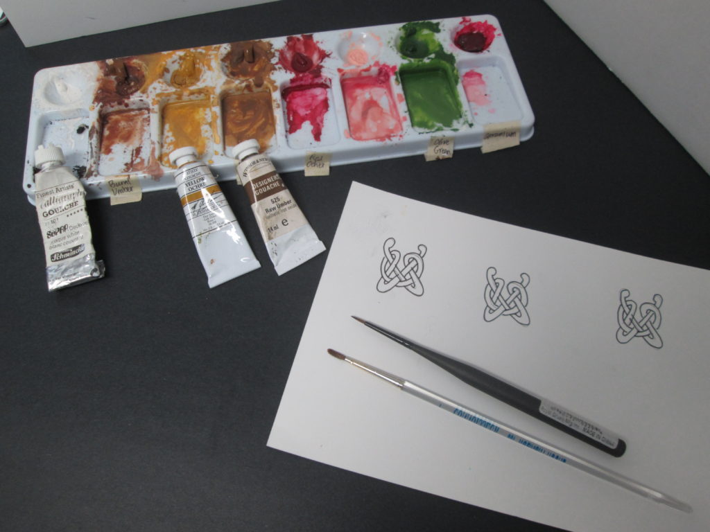
I paint primarily with gouache watercolor [say: guh-WASH]. It is opaque rather than the transparent watercolor most people associate with watercolor painting. My brushes are small and made of sable- sizes 1, 2 and 3 rounds and a size 00 liner brush. Check this website for this type of tool and supply. https://www.dickblick.com/
Because gouache paint is opaque the method of application to achieve highlights and shadows is different than working with more familiar transparent watercolor. Gouache requires flat areas of color that hide the paper beneath. Then additional color is added to create 3-dimensonality.
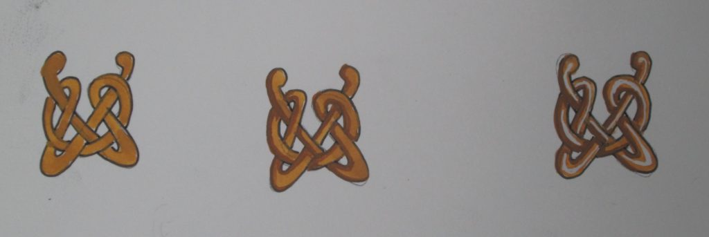
I used Fine-Tec metallic watercolor for the final bit of color in the borders and around the versal “B.”
I spent many hours painting while listening to my audio book. It is such a joy to be in my studio- a quiet and happy place!
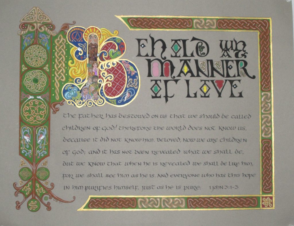
At last, it was done. If you are interested in purchasing this unframed piece, check my store.
What do you think?
Thanks for stopping by and please leave a comment.