Handwriting Letters

Handwriting letters is nearly a lost art. I think very few people write letters these days because of the instantaneous nature of texts, e-mails and even old fashioned phone calls. Taking pen in hand to write a letter requires time and thought. It reflects your care for the person to whom you write. It also requires a special skill set that many people of our day do not have. I am very concerned that cursive handwriting is no longer part of school curriculum in schools around our country. Even some of my own grandchildren who are home-schooled do not know how to write or read cursive handwriting. YIKES!!

Beside the concern I have about my “Grands” not having cursive under their belt, I have been convicted lately of something that I have read many times in the Bible. I need to be telling my grandchildren about our wonderful God. In Deuteronomy 6, we are commanded to teach the words of God “diligently to your [children]…” and in Psalm 78 to “tell to the generation to come the praises of the LORD, and His strength and His wondrous works that He has done.”

In an effort to obey the command of God to tell of His excellence to the next generation, I have decided to try to write at least one letter to each of my eight “Grands” every month. That means I only need to write 2 letters a week, which seems a manageable task. I hope to engage them about their lives and also begin dialog with them about the things of Scripture and connecting with them spiritually. Texting and even phone calls are not the best vehicles for this project.

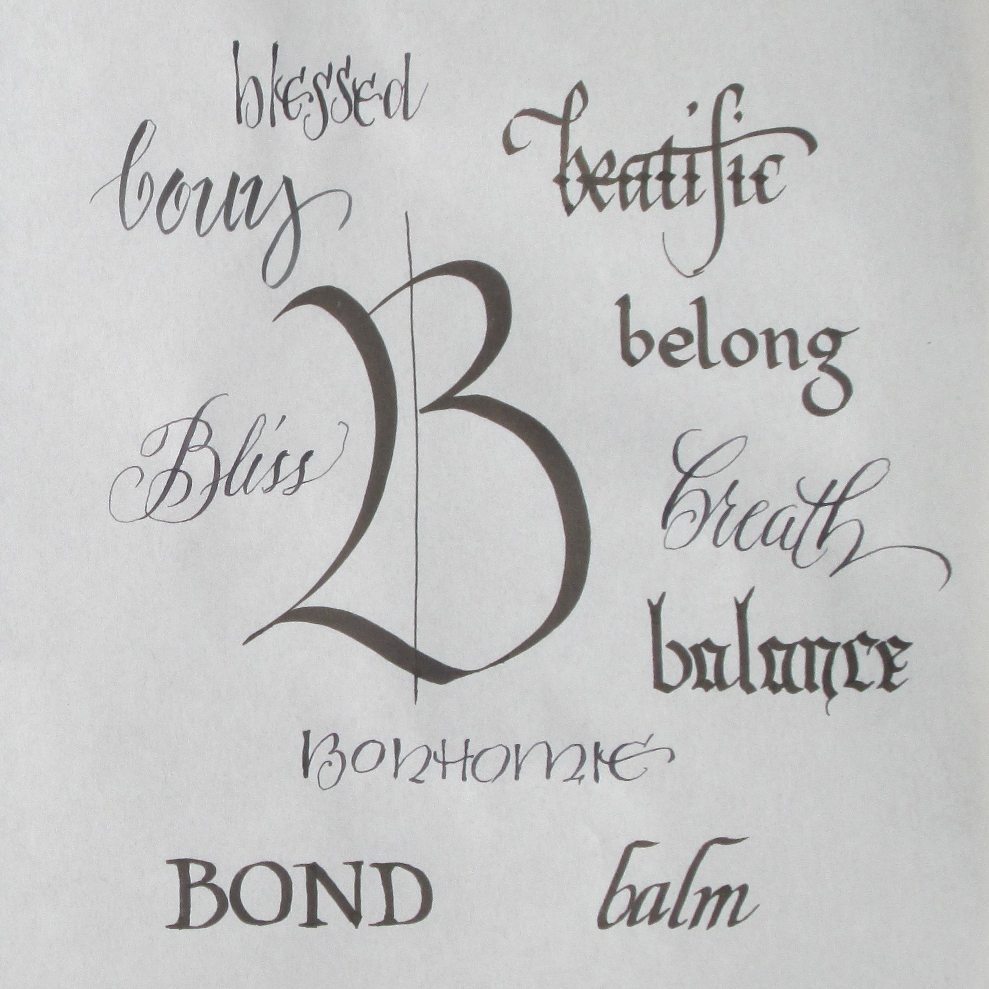
When I began, I stumbled on the realization that 5 of the 8 don’t read or write cursive handwriting. So to make myself understood by them, I created a “decoder” that would help them read the letter I have written to them. I also made a diagram about how to address an envelope because I feel sure they haven’t learned that particular bit of arcane “stuff of daily life” either. Not knowing how to do this is rather like learning to read an analog clock, balance a checkbook or write a thank you note– there are some basics to learn.

I wonder if you, my reader, may not know how to read and write cursive. I wonder how many of you have learned how to address an envelope. Maybe you have children you would like to teach cursive handwriting. Whatever the case, I’ve made a couple PDF files you are free to download to get you started.

 Decoder for cursive handwriting- PDF

How to address an envelope- PDF

Here is a 3 ½ minute YouTube video that will help you, as well.

“Learn to Write Capital and Small Alphabets in Cursive”

https://www.youtube.com/watch?v=iTF0AhQjU0k

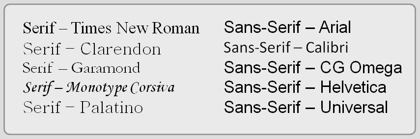
Once you learn each letter’s shape and the way to make it, you “string the letters together” by not lifting your pencil or pen as you write a word. The end of one letter swoops up to the next and that letter flows into the next until you have come to the end of your word. I think it is easier that picking up and putting down your pen with each discrete letter when you write manuscript style. (“printing”)

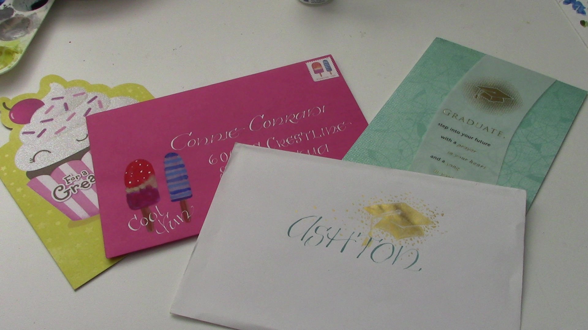
I have finished the first letters to the oldest sons of each family. One is a senior in college and the other a Jr. in high school. Here are the envelopes I made for their letters.

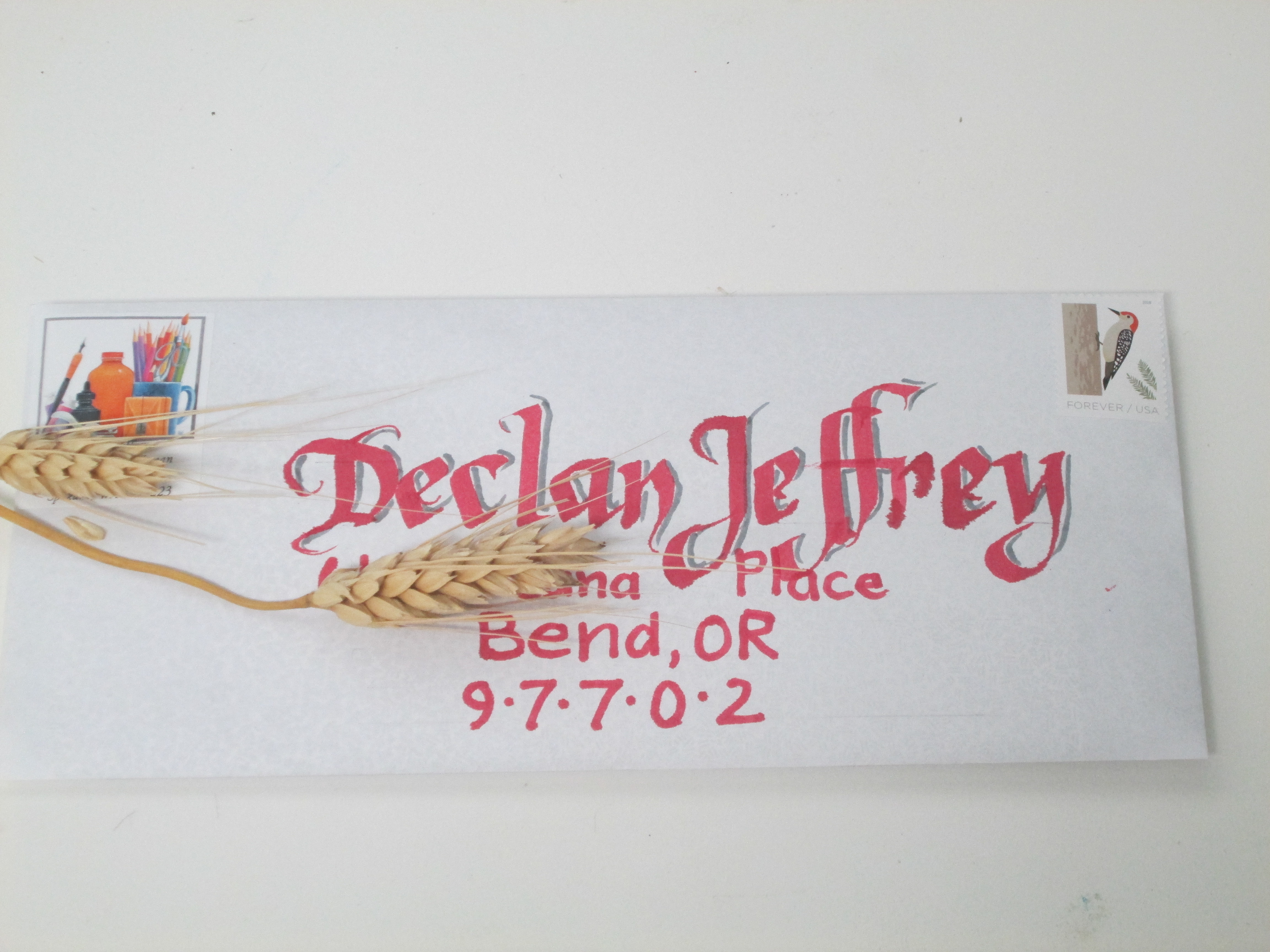
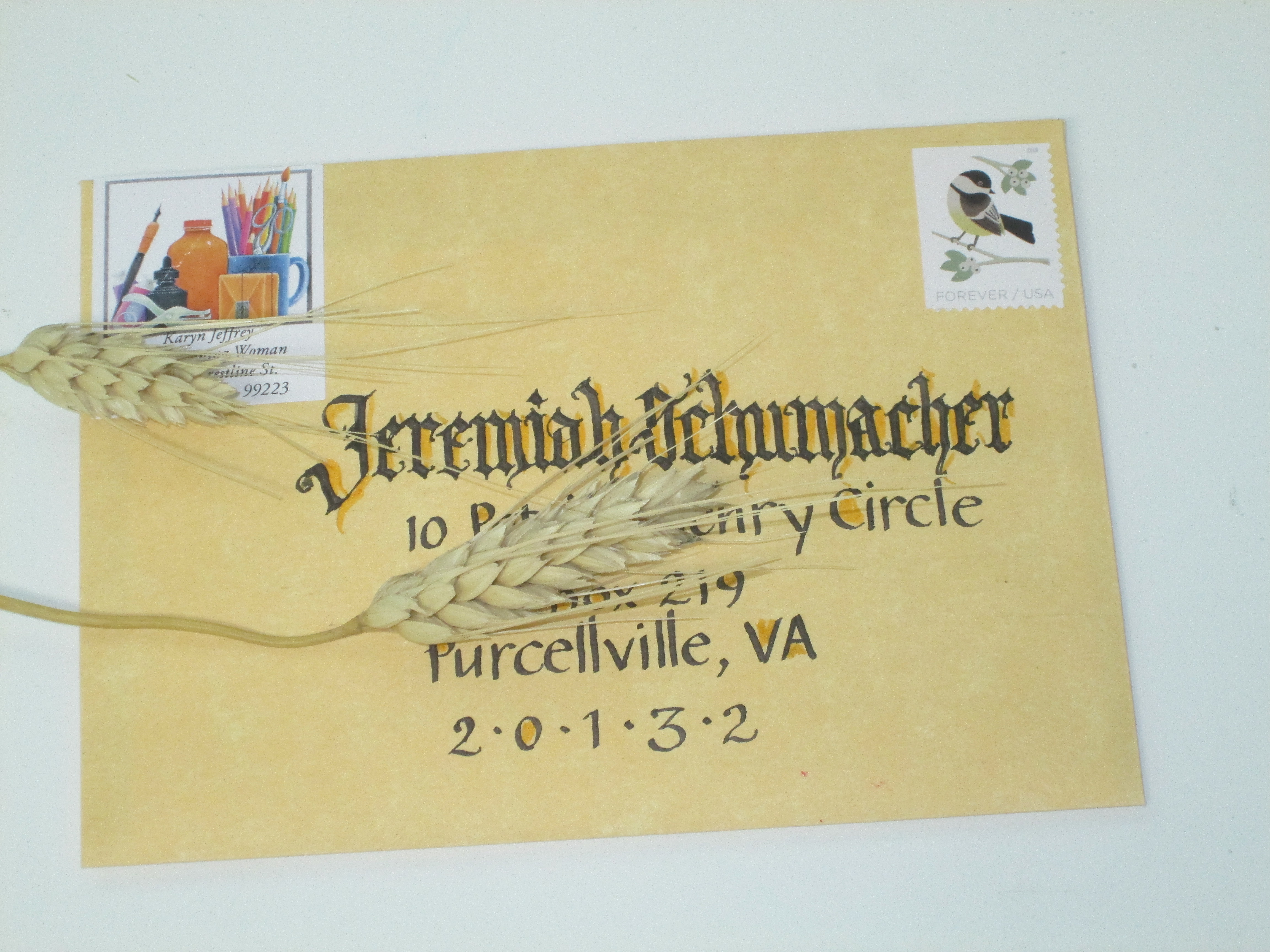
I’m hoping to catch their attention with a “decorated envelope.” I also have included the “decoder” and the “How to Address an Envelope” for them, and as an added prod, an envelope and a stamp and a cheery “I hope you will write back” P.S. I’m sure there will be a bit of eye-rolling, but underneath I hope they are stirred to making a regular interaction with me (Grammy).


QUESTION: Will you try to write a letter to someone special soon? If you don’t know how to write cursive handwriting will you try to learn?


Alphabets

I love Letters! 26 letters that strung together in millions of combinations make so many ways to convey what is in our mind

I am fascinated with alphabets. The various calligraphic hands have so many variations for the marks we make to convey meaning. More often than not, each letterform is a beautiful work of art all by itself. When I study an alphabet the aspects that give it its own unique character are so intriguing. When I sit down to practice my calligraphy I often write words in an alphabet list that are all of a theme, such as food: apple, banana, cabbage, doughnut, flapjack, gateau, etc. Or, animals: aardvark, bumblebee, cougar, dinosaur, elephant, flea, etc. Now, I am ready to try a new project. I want to practice the various calligraphic hands I know and use them to explore one theme, one letter at a time.  Here’s the backstory.

For my birthday, my Beloved Daughter gave me a book called Hind’s Feet in High Places: An Engaging Visual Journey by Hannah Hurnard (Author), Jill De Haan (Illustrator), Rachel McNaughton (Illustrator). It is a lovely new take on the old book written by Hannah Hurnard in the early 20th Century. The allegory, very reminiscent of Pilgrim’s Progress, has become a devotional classic. I was profoundly affected by it back in the early 1980’s when I first read it as a paperback. In this updated version, De Haan and McNaughton have illustrated and made the book a visual delight so the spiritual impact is even greater.

As I began reading again, I was struck by the following conversation between the Shepherd and Much-Afraid.

“As Love grows in you, Much-Afraid, you will come to understand many things which you never dreamed of before. You will develop the gift of understanding many ‘unknown tongues’ and you will learn to speak Love’s own language too, but first you must learn to spell out the alphabet of Love and to develop hinds’ feet. Both these things you will learn on the journey to the High Places…”    (Chapter 4)

Right then, I decided to try to make “an Alphabet of Love” and began casting about my creative crevices to think of a way to ponder LOVE in all its depth using calligraphy. I dragged out my college-days Merriam-Webster and began perusing the listings under A and B. I jotted down words that apply to love in some way. Then I started playing with various ways of presenting the alphabet and the words. As I began to letter the words I chose, I tried to use alphabets that convey something of the character of the word. As you read the words surrounding the central letter, ponder the connection to LOVE. What kind of love is implied by the word? What action does love take or cause?

Here is my first try with the first two letters. I’d be interested to know what you think. Pay attention… new letters may appear in weeks ahead.

QUESTION: Should I continue this project this way? What other ideas might work? Shoot me a comment or suggestion—I’d love to hear from you!

Envelope Inspiration: A Stamp Starts It All

Today I have created a decorated envelope that draws its inspiration from a stamp. With a season of events that need decorated envelopes to carry the greetings, I’ve been using the opportunity to work at my art and make memorable greetings. “Decorated Envelopes” for a friend who has had surgery, a cousin who is having a birthday and a great niece who is graduating from college—what a fun way to play in my studio! The stamp, and sometimes the commercially made card design itself, inspire my envelopes. Watch this short video to see one “happen.”

Decorated Envelopes ready to send

I’m using gouache paint which is an opaque watercolor. The stamp I am inspired by is one you can get from the US Post Office. If it isn’t available at your PO, go online to  https://store.usps.com/store/results/stamps/_/N-9y93lv     You can order stamps and they are delivered right to your mailbox. How cool is that?

Hope you enjoy the video.  Now, I’m off to shower and prepare for a graduation celebration.

https://youtu.be/VZQ2uV-w424

Question: What stamp can inspire you to create a decorated envelope for someone special in your life?

Envelopes, Please!

Have you ever received a decorated envelope?

This week I have been making a fresh set of 14 decorated envelopes because I am the organizer of the annual Decorated Envelope Exchange for Write On Calligraphers. (http://writeoncalligraphers.org/) This calligraphy guild is in Western Washington and has members from all over the northern West Coast. The participants in the Decorated Envelope Exchange attend the annual Letters of Joy (LOJ) Calligraphy conference in early May. Some sign up to be part of the exchange of decorated envelopes over the months between conferences.

The concept is simple. The list of those who sign up to participate is organized into groups of 6 to 8 people per list. Over the year each person sends an envelope to each name on the list in which they are included. The envelopes can be simple or elaborate but each is a delightful work of art. Calligraphers especially seem to relish this creative opportunity. It is a fun way to share calligraphic skills and artistic inspiration.

I often use the stamp as a “jump-off” point for my designs.

                     The envelopes I sent in 2017 were based on stamps that showcased various Hispanic foods.

This year my envelopes are designed around the Post Office’s “scratch and sniff” stamps with 2 popsicles on each one.

This year, each envelope has a colored pencil drawing based on the popsicles on the stamps so no two envelopes are the same.

Check out the archived decorated envelope designs from those entered in the annual Graceful Envelope Contest. It is sponsored by the Washington (DC) Calligraphers Guild and the National Association of Letter Carriers. https://www.calligraphersguild.org/envelope.html  This year’s theme was “Put Your Stamp On It.” You can peruse several years of past entries and it is a really fascinating “eye candy” experience! I entered an envelope this year and am waiting to find out if it made it into the honorable mention column.

Another fun place to look at decorated envelopes is in Bound and Lettered magazine. (This magazine is a publication from John Neal Books. It is a supplier to calligraphy and bookmaking artists.) John Neal sponsored a contest last year in conjunction with the annual International Calligraphy Convention called “SeattLetters.” I entered an envelope with my design based on a stamp. It made the pages of Bound and Lettered.  Check out my envelope by scrolling down in the PDF here: https://s3.amazonaws.com/cdn.johnnealbooks.com/downloads/15-4pgs.pdf

I am a wild enthusiast of hand-lettered and decorated envelopes. It is a fun way to share my love of calligraphy and my art. It also lets my friends and family know how much I love them by making their names in “fancy” letters and painting or drawing something special just for them.

QUESTION: Who could you send a decorated envelope to? Are you brave enough to add a bit of artwork to the envelope of the birthday or graduation cared you are about to send off? Don’t you think your Mail Carrier will enjoy it (not to mention the Receiver-of-the-Envelope)?

A Lettering Project

Hello! I am so glad you stopped by.  I hope this post will give you a bit of a look behind the scenes of my art-making. I am sharing a video I made of myself doing a project for a lettering class I am taking at my local art supply store (Spokane Art Supply  http://spokaneartsupply.com/). The class is intended for beginning students in calligraphy. It is open to more advanced students who want weekly accountability and critique. I fall into the latter category and am so glad I decided to do this. Our teacher taught calligraphy at the local Community College and is very knowledgeable about the history of lettering. It has been very interesting to hear and see (he demonstrates so well!) the way letters have developed into the forms we recognize today.

Our first formal lettering project was to use the alphabet designed by Rudolf Koch- a German type designer and artist who lived during the early 20th century. Neuland is blocky and sans serif. Because every stroke is the same width the appearance is very dense. Sans serif means “without serifs.” Serifs are the little feet and shoulders on letters. Here is a diagram showing the difference between a font with serif and a font san serif. (Thanks, Bing online images!)

The little green circles show you the places that the little “shoulders” and “feet” are on the serifed font and where they are absent on the sans serif font.


Sans Serif alphabets are somewhat easier to read if the shapes of the letters don’t get too creative.

Here you can compare readabilityof fonts with and without serifs. What do you think?

Here is a sample of “Neuland” that Koch designed. It is a bit tricky to read because of the evenness of the type. Compare it to the “Arial” font in the chart above.

Notice the dense, overall texture that this lettering style creates. Readability is definitely diminished, don’t you think?

But one of the fun parts of the Neuland font is that it is open to adding color and designs in the spaces around and between the letters as well as within the “counters” of letters. The counters are the spaces enclosed by the shapes of letters—the circle within the ‘O’ and the triangle within the ‘A’ and so on.

https://i.pinimg.com/originals

Here is another sample of Koch’s work with color added in the counters and between some letters. He has also been more free with the letter shapes (not so blocky) and the height of the letters is more than the usual so the letters have a “slimmer”, more open look. Which sample do you like best?


Aha! You have just learned something about letters and lettering. And you didn’t even need to take a class!

And now here is my video. I think it will explain itself. I hope you enjoy watching the progress of the project for my class.

PS… I could have done a different design that would have gotten a “better grade”… Teacher had some critiques that I may take into account if and when I’m create version #2. Stay tuned.

QUESTION:  What sort of project are you doing this week? What new thing have you learned?

Painting Celtic Knot Work with Gouache

This week I am taking a break from overtly spiritual reflections and have prepared a video highlighting how I work on one of my illuminated letters. I am working on a set of all 26 letters of the alphabet and this letter “A” is my first. The video shows how I paint Celtic knot work and it gives you a bit of background in what my tools and materials are for painting in this ancient style.

I hope you will come along and watch as I paint on my Celtic letter “A”.

You can find this and other tutorial videos on my YouTube channel  (Karyn Jeffrey- The Designing Woman   https://www.youtube.com/channel/UC_J6vhzsxkCeAkwXs7PqTQw  )

QUESTION: Have you every painted in watercolor? Opaque watercolor? (gouache) Ever wanted to?