Alphabet of Love- Part 2

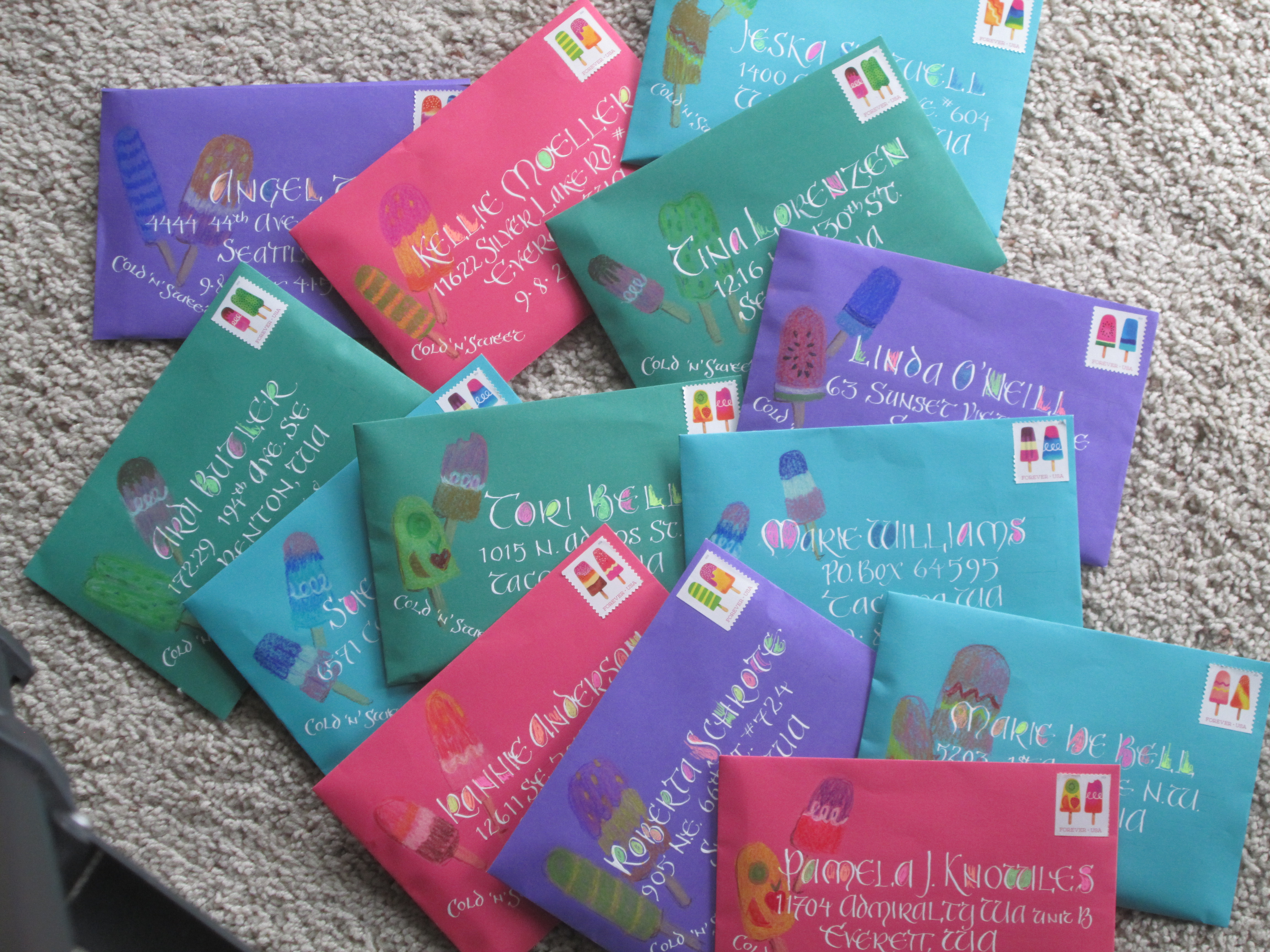
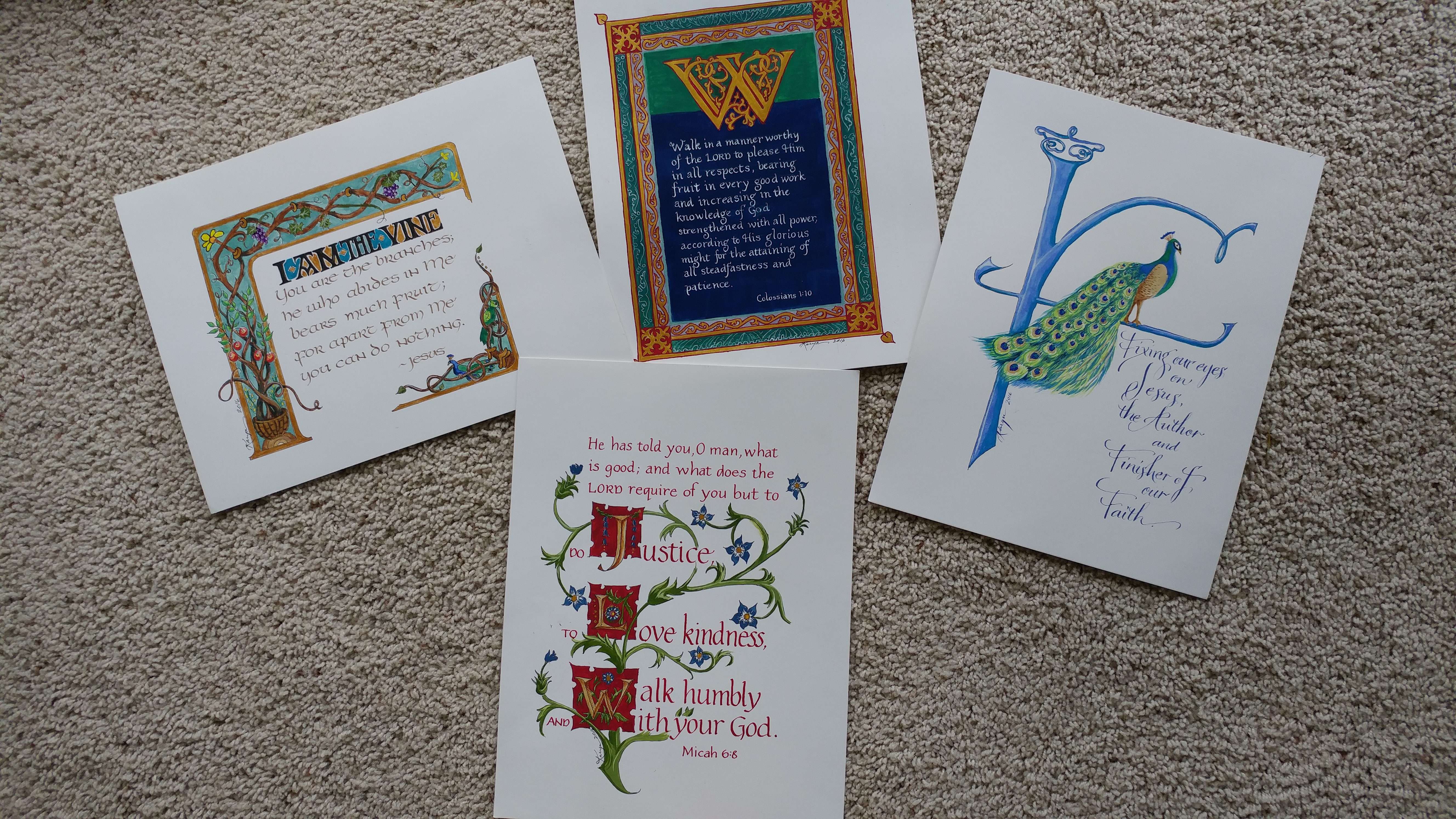
I’ve completed several more letters for my Alphabet of Love. (For the first two letters see the post July 12, 2019, “Alphabets”)

the letter “C”
The letter D

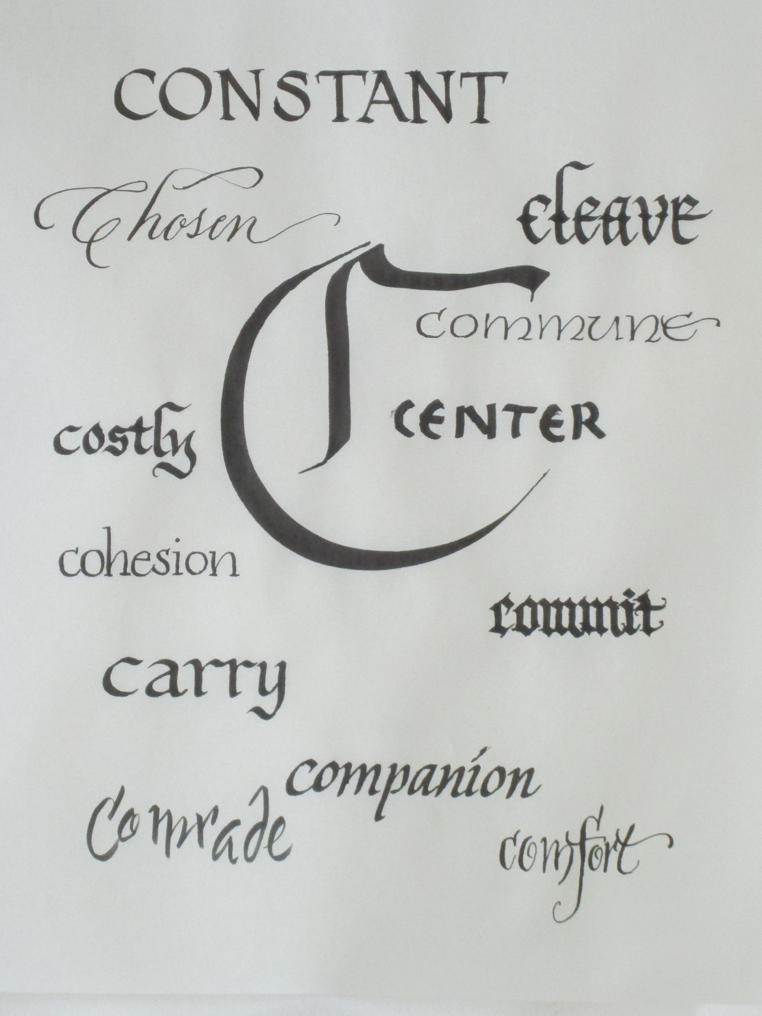
The letters C and D which you see here have some words that stir my thoughts about love. Listen to the definition of LOVE as a noun.

“1: affection based on admiration or benevolence. 2: warm attachment, enthusiasm, or devotion. 3: unselfish concern that freely accepts another in loyalty and seeks his good. 4: the attraction based on sexual desire: the affection and tenderness felt by lovers.

And hear it defined as a transitive verb.

 “1: to hold dear: cherish 2: to feel a lover’s passion, devotion or tenderness for.”

These definitions cause me to think about my relationships with God, my husband, my mother, siblings, and friends…AND with “things”.  I get a serious nudge from the Holy Spirit. I am commanded not to love the world or the things of it. Arghhh. That comes uncomfortably close! My preoccupation with my clothes, my household furnishings, my car, my “expertise” at painting or calligraphy. Anything that becomes a focus in place of my allegiance to God is the wrong way to spend my “love.”

Now that I have made these art pieces, when I look at the words I chose much comes to mind.

Beginning with words starting with theh letter C there is much to ponder.

God’s love for me will never change. He is CONSTANT. My prayer: ‘Lord, help me love You in return with constancy.’

“For I, the LORD, do not change; therefore you, O sons of Jacob, are not consumed.” Malachi 3:6

I continue to marvel that Beloved Spouse decided to ask me to dance in that “social dance” class at college. I am indeed CHOSEN. What a happy thing it has been these many years with him. And even greater joy is to be called the child of God. I’m CHOSEN by the Creator of the Universe! Amazing!

“See how great a love the Father has bestowed on us, that we would be called children of God; and such we are,…” 1 John 3:1

The relationship between two people who “love” each other requires COHESION to weather the storms of life. Thankfully God has blessed Beloved Spouse and me with the gift of learning to “cohere” in spite of our totally different personalities and ways of doing things.

“But there is a friend who sticks closer than a brother.” Proverbs 18:24

I am so thankful that God has promised to help me when I have no strength of my own. He will CARRY me in His bosom as His beloved lamb.

“Like a shepherd He will tend His flock, in His arm He will gather the lambs and carry them in His bosom; He will gently lead the nursing ewes.” Isaiah 40:11

God knows every thought of my mind and every trouble in my heart. He has given me His own dear presence as COMFORT in this fallen world.

“Blessed be the God and Father of our Lord Jesus Christ, the Father of mercies and God of all comfort, who comforts us in all our affliction so that we will be able to comfort those who are in any affliction with the comfort with which we ourselves are comforted by God.” 2 Corinthians 1: 3-4

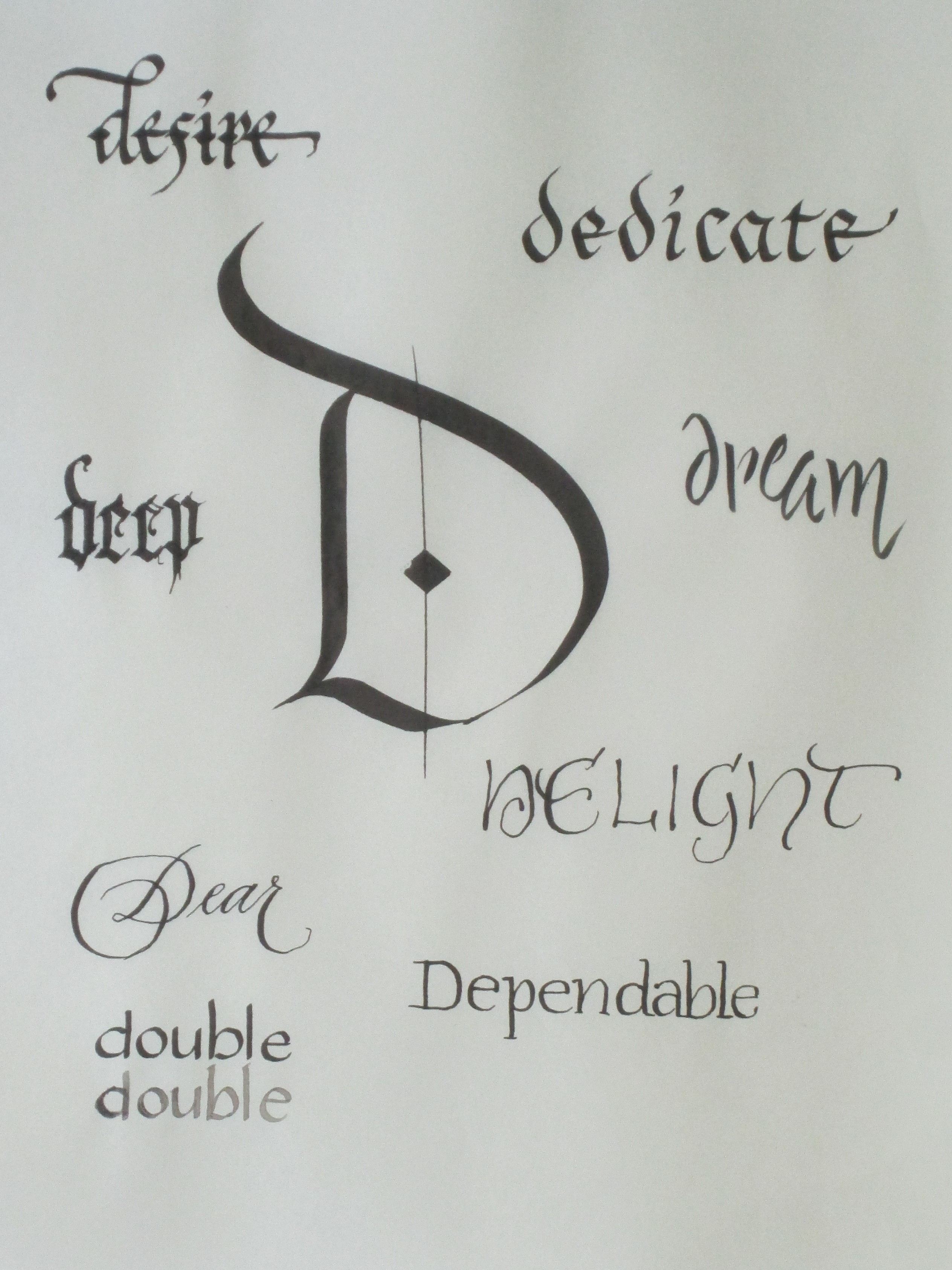
And then there is the letter D. Let’s dive in to the ways “D” words develop our theme. (Pardon the alliteration… I love to play with words and sounds.)

Have you heard the song by Chris Rice Deep Enough to Dream?  He sings about dreaming of heaven. When I think of the love that God has lavished on me that will give me that deep and everlasting joy of His presence, I know love. His love for me is DEEP and it is such a wonderful thing to DREAM of my eternity with Him enjoying every delight of heaven.

Question: What comes to your mind when you ponder the words written by each letter so far? Can you see the connection to LOVE?

Envelopes, Please!

Have you ever received a decorated envelope?

This week I have been making a fresh set of 14 decorated envelopes because I am the organizer of the annual Decorated Envelope Exchange for Write On Calligraphers. (http://writeoncalligraphers.org/) This calligraphy guild is in Western Washington and has members from all over the northern West Coast. The participants in the Decorated Envelope Exchange attend the annual Letters of Joy (LOJ) Calligraphy conference in early May. Some sign up to be part of the exchange of decorated envelopes over the months between conferences.

The concept is simple. The list of those who sign up to participate is organized into groups of 6 to 8 people per list. Over the year each person sends an envelope to each name on the list in which they are included. The envelopes can be simple or elaborate but each is a delightful work of art. Calligraphers especially seem to relish this creative opportunity. It is a fun way to share calligraphic skills and artistic inspiration.

I often use the stamp as a “jump-off” point for my designs.

                     The envelopes I sent in 2017 were based on stamps that showcased various Hispanic foods.

This year my envelopes are designed around the Post Office’s “scratch and sniff” stamps with 2 popsicles on each one.

This year, each envelope has a colored pencil drawing based on the popsicles on the stamps so no two envelopes are the same.

Check out the archived decorated envelope designs from those entered in the annual Graceful Envelope Contest. It is sponsored by the Washington (DC) Calligraphers Guild and the National Association of Letter Carriers. https://www.calligraphersguild.org/envelope.html  This year’s theme was “Put Your Stamp On It.” You can peruse several years of past entries and it is a really fascinating “eye candy” experience! I entered an envelope this year and am waiting to find out if it made it into the honorable mention column.

Another fun place to look at decorated envelopes is in Bound and Lettered magazine. (This magazine is a publication from John Neal Books. It is a supplier to calligraphy and bookmaking artists.) John Neal sponsored a contest last year in conjunction with the annual International Calligraphy Convention called “SeattLetters.” I entered an envelope with my design based on a stamp. It made the pages of Bound and Lettered.  Check out my envelope by scrolling down in the PDF here: https://s3.amazonaws.com/cdn.johnnealbooks.com/downloads/15-4pgs.pdf

I am a wild enthusiast of hand-lettered and decorated envelopes. It is a fun way to share my love of calligraphy and my art. It also lets my friends and family know how much I love them by making their names in “fancy” letters and painting or drawing something special just for them.

QUESTION: Who could you send a decorated envelope to? Are you brave enough to add a bit of artwork to the envelope of the birthday or graduation cared you are about to send off? Don’t you think your Mail Carrier will enjoy it (not to mention the Receiver-of-the-Envelope)?

A Lettering Project

Hello! I am so glad you stopped by.  I hope this post will give you a bit of a look behind the scenes of my art-making. I am sharing a video I made of myself doing a project for a lettering class I am taking at my local art supply store (Spokane Art Supply  http://spokaneartsupply.com/). The class is intended for beginning students in calligraphy. It is open to more advanced students who want weekly accountability and critique. I fall into the latter category and am so glad I decided to do this. Our teacher taught calligraphy at the local Community College and is very knowledgeable about the history of lettering. It has been very interesting to hear and see (he demonstrates so well!) the way letters have developed into the forms we recognize today.

Our first formal lettering project was to use the alphabet designed by Rudolf Koch- a German type designer and artist who lived during the early 20th century. Neuland is blocky and sans serif. Because every stroke is the same width the appearance is very dense. Sans serif means “without serifs.” Serifs are the little feet and shoulders on letters. Here is a diagram showing the difference between a font with serif and a font san serif. (Thanks, Bing online images!)

The little green circles show you the places that the little “shoulders” and “feet” are on the serifed font and where they are absent on the sans serif font.


Sans Serif alphabets are somewhat easier to read if the shapes of the letters don’t get too creative.

Here you can compare readabilityof fonts with and without serifs. What do you think?

Here is a sample of “Neuland” that Koch designed. It is a bit tricky to read because of the evenness of the type. Compare it to the “Arial” font in the chart above.

Notice the dense, overall texture that this lettering style creates. Readability is definitely diminished, don’t you think?

But one of the fun parts of the Neuland font is that it is open to adding color and designs in the spaces around and between the letters as well as within the “counters” of letters. The counters are the spaces enclosed by the shapes of letters—the circle within the ‘O’ and the triangle within the ‘A’ and so on.

https://i.pinimg.com/originals

Here is another sample of Koch’s work with color added in the counters and between some letters. He has also been more free with the letter shapes (not so blocky) and the height of the letters is more than the usual so the letters have a “slimmer”, more open look. Which sample do you like best?


Aha! You have just learned something about letters and lettering. And you didn’t even need to take a class!

And now here is my video. I think it will explain itself. I hope you enjoy watching the progress of the project for my class.

PS… I could have done a different design that would have gotten a “better grade”… Teacher had some critiques that I may take into account if and when I’m create version #2. Stay tuned.

QUESTION:  What sort of project are you doing this week? What new thing have you learned?

Creative Juices Flowing

Here is where my artistic juices have been flowing lately. I’ve spent the past several days creating in this most inspirational space. Did you notice that it is the same color as my new bedroom?

Here she takes a nervous gulp and blurts out:

studio in some semblance of order- thankfully ink smudges and dog fur not visible

“I am about to launch a serious ‘social media campaign.’ ”

This is definitely tame by the standard of many younger folks but for a “mature” woman like myself it feels like a leap into a galaxy far, far away! So here is what is planned:  I am preparing to begin uploading pics to Instagram and making a bigger presence on Face Book and be more intentional and regular in posting on my blog.

these designs will be cards for sale soon. Planning for the Studio Art Tour in September for sure

I am preparing for the Art Tour in September and so have created 4 designs for 5” x 7” greeting cards. Will be taking them to my art photographer guy today. Look for ways to order them from me sometime soon. Also planning to get a coloring book made from the black and white line drawings of the letters in my book. Busy, busy, busy. But, oh, does it feel wonderful to be back in my studio making art!

So, hop on over to my book website  –  lifeinlettersbook.com (order a book while you are there!), check me out on Instagram – (karynjeffrey) (Whoo-hoo! This is new!) or find me on Face BookKaryn Jeffrey- The Designing Woman.

my book: Life In Letters- A Christian Young Person's Guide to Virtue, Integrity and Peace
my book: Life In Letters- A Christian Young Person’s Guide to Virtue, Integrity and Peace

I’ve put an RSS feed URL here so you can get notified regularly when I post something new. I am hoping to post at least once a week and maybe add a picture of current art work on a different day.

Thanks for stopping by!  Please leave a comment– it would help to know who is looking.