Hello! I am so glad you stopped by. I hope this post will give you a bit of a look behind the scenes of my art-making. I am sharing a video I made of myself doing a project for a lettering class I am taking at my local art supply store (Spokane Art Supply http://spokaneartsupply.com/). The class is intended for beginning students in calligraphy. It is open to more advanced students who want weekly accountability and critique. I fall into the latter category and am so glad I decided to do this. Our teacher taught calligraphy at the local Community College and is very knowledgeable about the history of lettering. It has been very interesting to hear and see (he demonstrates so well!) the way letters have developed into the forms we recognize today.
Our first formal lettering project was to use the alphabet designed by Rudolf Koch- a German type designer and artist who lived during the early 20th century. Neuland is blocky and sans serif. Because every stroke is the same width the appearance is very dense. Sans serif means “without serifs.” Serifs are the little feet and shoulders on letters. Here is a diagram showing the difference between a font with serif and a font san serif. (Thanks, Bing online images!)

Sans Serif alphabets are somewhat easier to read if the shapes of the letters don’t get too creative.
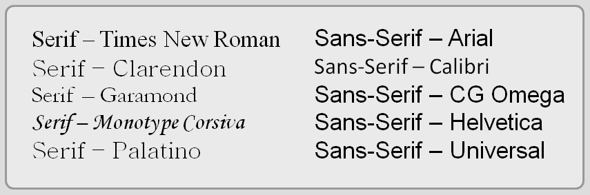
Here is a sample of “Neuland” that Koch designed. It is a bit tricky to read because of the evenness of the type. Compare it to the “Arial” font in the chart above.
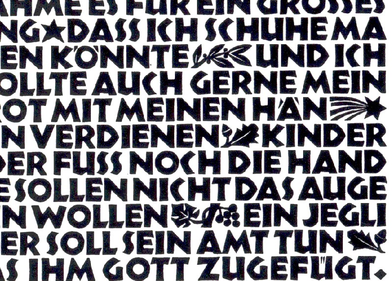
But one of the fun parts of the Neuland font is that it is open to adding color and designs in the spaces around and between the letters as well as within the “counters” of letters. The counters are the spaces enclosed by the shapes of letters—the circle within the ‘O’ and the triangle within the ‘A’ and so on.
https://i.pinimg.com/originals

Aha! You have just learned something about letters and lettering. And you didn’t even need to take a class!
And now here is my video. I think it will explain itself. I hope you enjoy watching the progress of the project for my class.
PS… I could have done a different design that would have gotten a “better grade”… Teacher had some critiques that I may take into account if and when I’m create version #2. Stay tuned.
QUESTION: What sort of project are you doing this week? What new thing have you learned?