Envelope Inspiration: A Stamp Starts It All

Today I have created a decorated envelope that draws its inspiration from a stamp. With a season of events that need decorated envelopes to carry the greetings, I’ve been using the opportunity to work at my art and make memorable greetings. “Decorated Envelopes” for a friend who has had surgery, a cousin who is having a birthday and a great niece who is graduating from college—what a fun way to play in my studio! The stamp, and sometimes the commercially made card design itself, inspire my envelopes. Watch this short video to see one “happen.”
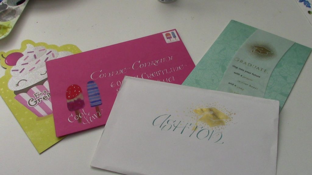
Decorated Envelopes ready to send

I’m using gouache paint which is an opaque watercolor. The stamp I am inspired by is one you can get from the US Post Office. If it isn’t available at your PO, go online to  https://store.usps.com/store/results/stamps/_/N-9y93lv     You can order stamps and they are delivered right to your mailbox. How cool is that?

Hope you enjoy the video.  Now, I’m off to shower and prepare for a graduation celebration.

https://youtu.be/VZQ2uV-w424

Question: What stamp can inspire you to create a decorated envelope for someone special in your life?

A Lettering Project

Hello! I am so glad you stopped by.  I hope this post will give you a bit of a look behind the scenes of my art-making. I am sharing a video I made of myself doing a project for a lettering class I am taking at my local art supply store (Spokane Art Supply  http://spokaneartsupply.com/). The class is intended for beginning students in calligraphy. It is open to more advanced students who want weekly accountability and critique. I fall into the latter category and am so glad I decided to do this. Our teacher taught calligraphy at the local Community College and is very knowledgeable about the history of lettering. It has been very interesting to hear and see (he demonstrates so well!) the way letters have developed into the forms we recognize today.

Our first formal lettering project was to use the alphabet designed by Rudolf Koch- a German type designer and artist who lived during the early 20th century. Neuland is blocky and sans serif. Because every stroke is the same width the appearance is very dense. Sans serif means “without serifs.” Serifs are the little feet and shoulders on letters. Here is a diagram showing the difference between a font with serif and a font san serif. (Thanks, Bing online images!)

The little green circles show you the places that the little “shoulders” and “feet” are on the serifed font and where they are absent on the sans serif font.


Sans Serif alphabets are somewhat easier to read if the shapes of the letters don’t get too creative.

Here you can compare readabilityof fonts with and without serifs. What do you think?

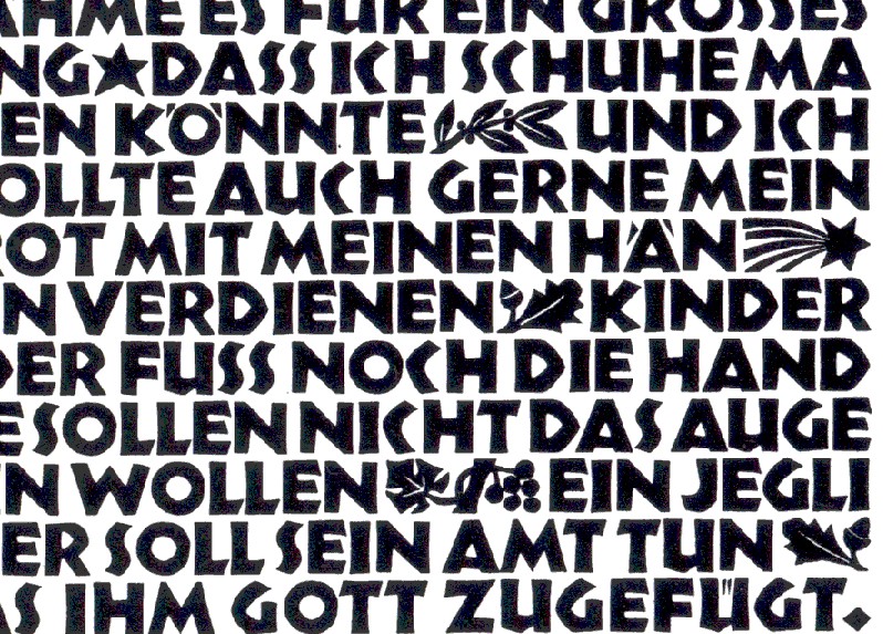
Here is a sample of “Neuland” that Koch designed. It is a bit tricky to read because of the evenness of the type. Compare it to the “Arial” font in the chart above.

Notice the dense, overall texture that this lettering style creates. Readability is definitely diminished, don’t you think?

But one of the fun parts of the Neuland font is that it is open to adding color and designs in the spaces around and between the letters as well as within the “counters” of letters. The counters are the spaces enclosed by the shapes of letters—the circle within the ‘O’ and the triangle within the ‘A’ and so on.

https://i.pinimg.com/originals

Here is another sample of Koch’s work with color added in the counters and between some letters. He has also been more free with the letter shapes (not so blocky) and the height of the letters is more than the usual so the letters have a “slimmer”, more open look. Which sample do you like best?


Aha! You have just learned something about letters and lettering. And you didn’t even need to take a class!

And now here is my video. I think it will explain itself. I hope you enjoy watching the progress of the project for my class.

PS… I could have done a different design that would have gotten a “better grade”… Teacher had some critiques that I may take into account if and when I’m create version #2. Stay tuned.

QUESTION:  What sort of project are you doing this week? What new thing have you learned?

Painting Celtic Knot Work with Gouache

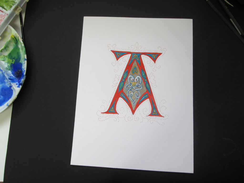
This week I am taking a break from overtly spiritual reflections and have prepared a video highlighting how I work on one of my illuminated letters. I am working on a set of all 26 letters of the alphabet and this letter “A” is my first. The video shows how I paint Celtic knot work and it gives you a bit of background in what my tools and materials are for painting in this ancient style.

I hope you will come along and watch as I paint on my Celtic letter “A”.

You can find this and other tutorial videos on my YouTube channel  (Karyn Jeffrey- The Designing Woman   https://www.youtube.com/channel/UC_J6vhzsxkCeAkwXs7PqTQw  )

QUESTION: Have you every painted in watercolor? Opaque watercolor? (gouache) Ever wanted to?