Envelope Inspiration: A Stamp Starts It All

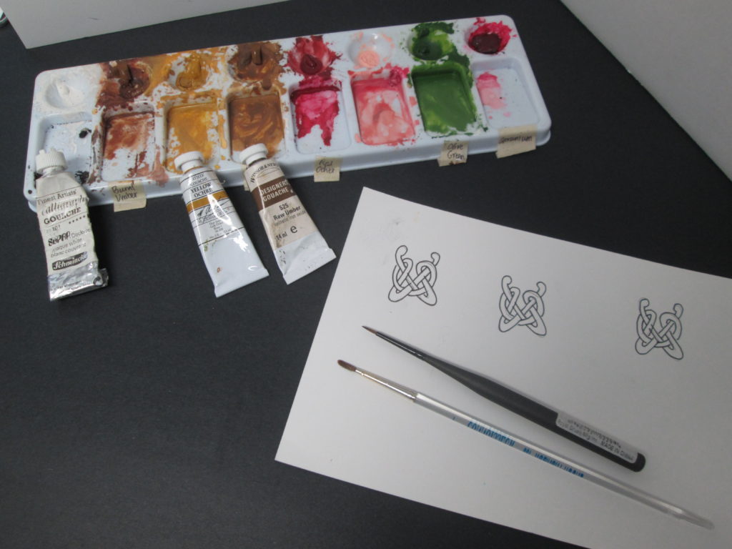
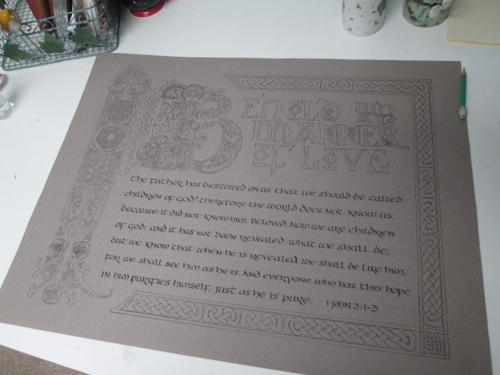
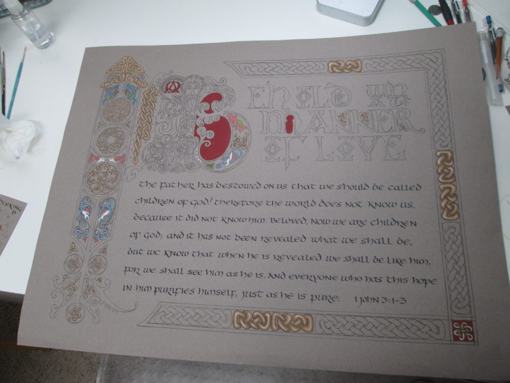
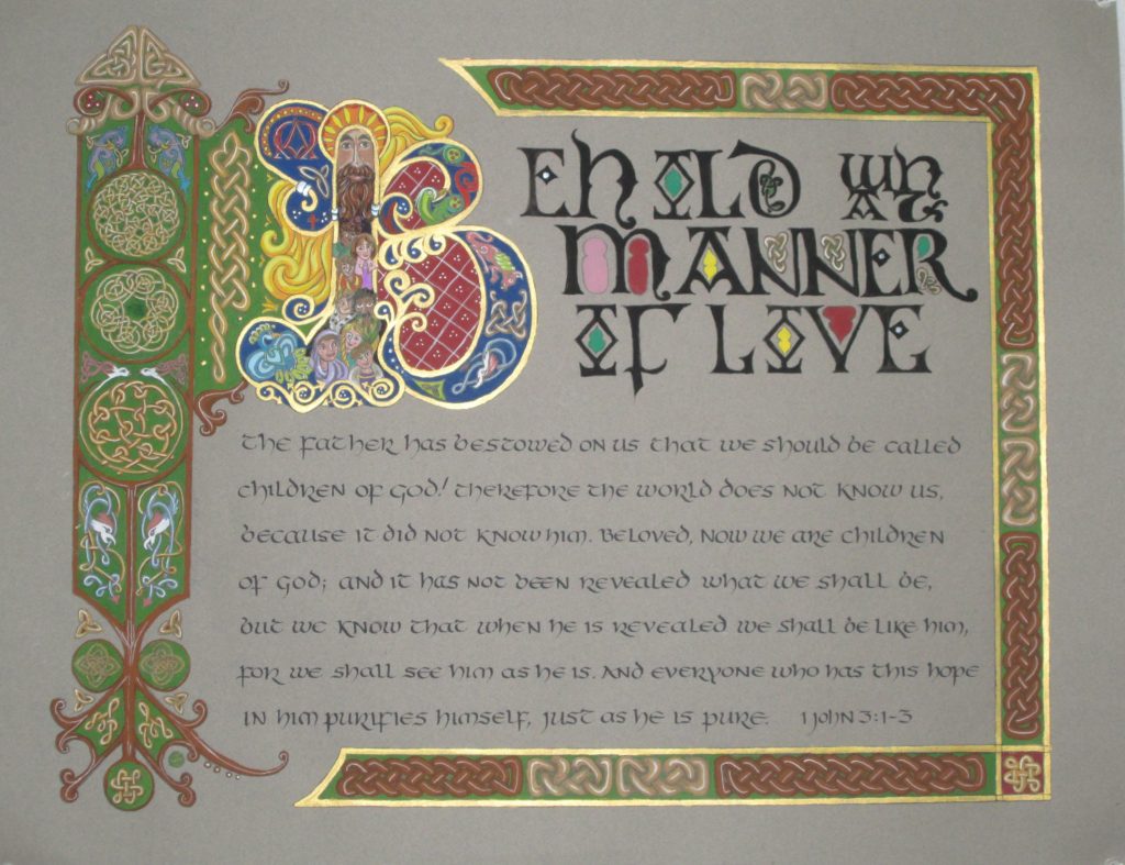
Today I have created a decorated envelope that draws its inspiration from a stamp. With a season of events that need decorated envelopes to carry the greetings, I’ve been using the opportunity to work at my art and make memorable greetings. “Decorated Envelopes” for a friend who has had surgery, a cousin who is having a birthday and a great niece who is graduating from college—what a fun way to play in my studio! The stamp, and sometimes the commercially made card design itself, inspire my envelopes. Watch this short video to see one “happen.”

Decorated Envelopes ready to send

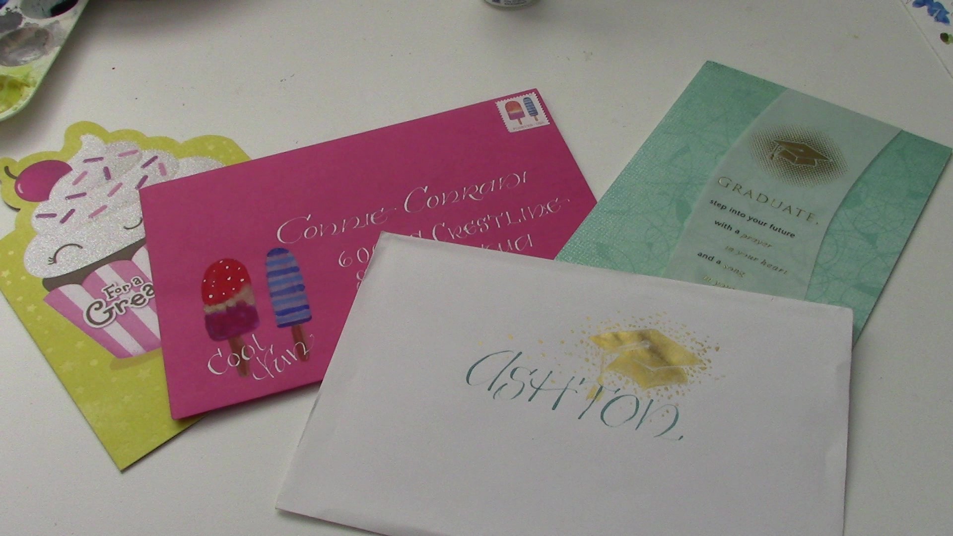
I’m using gouache paint which is an opaque watercolor. The stamp I am inspired by is one you can get from the US Post Office. If it isn’t available at your PO, go online to  https://store.usps.com/store/results/stamps/_/N-9y93lv     You can order stamps and they are delivered right to your mailbox. How cool is that?

Hope you enjoy the video.  Now, I’m off to shower and prepare for a graduation celebration.

https://youtu.be/VZQ2uV-w424

Question: What stamp can inspire you to create a decorated envelope for someone special in your life?

Painting Celtic Knot Work with Gouache

This week I am taking a break from overtly spiritual reflections and have prepared a video highlighting how I work on one of my illuminated letters. I am working on a set of all 26 letters of the alphabet and this letter “A” is my first. The video shows how I paint Celtic knot work and it gives you a bit of background in what my tools and materials are for painting in this ancient style.

I hope you will come along and watch as I paint on my Celtic letter “A”.

You can find this and other tutorial videos on my YouTube channel  (Karyn Jeffrey- The Designing Woman   https://www.youtube.com/channel/UC_J6vhzsxkCeAkwXs7PqTQw  )

QUESTION: Have you every painted in watercolor? Opaque watercolor? (gouache) Ever wanted to?


Mistakes I have made- An Illumination – troubles and all– from start to finish

I have been working on a large calligraphy piece for the past several months. The process has been a rocky road with more trouble than usual. The size of the project seemed to magnify the mistakes and deepen my frustration. Let me take you on a journey of through a lot of calligraphy mistakes. I hope it inspires you to persevere when a project of yours starts to “go south.”

I began painting this piece before Christmas and was quite pleased with my effort until I laid it out to photograph it. ARHGH! In all the weeks of work I had not noticed that the band of design on the left is tilted—crooked.

first version of behold
My first try – so much work- such big mistakes! ARGH!!

The plan for framing it for sale was out. The crookedness would be so obvious that there was no way I could retrieve it. I laid it aside to enjoy the whirl of the holiday seasons with some lessons learned.

Lesson 1: Check and double check initial drawing for accuracy before adding any permanent medium.

Lesson 2: Breathe. Back away slowly.

January rolled around and I was ready to tackle a new version. This time I decided to use a darker paper. This would need a white transfer paper, I thought, to put the cartoon down for inking.

I placed and taped down the drawing which was a mish-mash on the tracing paper and grid paper I had used before. I was careful to be sure they were “square with the world” this time and so spent a few hours transferring the drawing.

taped down to trace

To transfer the drawing down I used a red ink fine-line G-Tec-C4  pen 0.4MM   https://www.amazon.com/Pilot-G-Tec-C4-Assorted-Colors-Rollerball   to assure a clear, even line on the dark paper and a colored line I could see on the cartoon as I made the tracing.

g-tec pens

When I removed the tracing papers and transfer paper, I was pleased that I could easily see the white drawing all ready for my ink outline. “Onward!!”

I took out my favorite waterproof fine-line pen- Faber-Castell Pitt pigmented drawing ink pen (available in various widths) https://www.amazon.com/Pigmented-Drawing-Artist-Widths-Castell/ and started on the inking.

pitt pens

The process wasn’t smooth sailing because the ink did not like the waxiness of the white transfer lines. Grrrr. >:{  I had failed to test that aspect before beginning the tracing process. But undeterred, I kept inking. But then, as I began my way up the left band (oh! That left band!!) I realized I had a HUGE problem. During the tracing process, the drawings had shifted nearly a quarter inch. There was no way to bridge the skewed design areas.

bad tracing

I stopped. Nearly cried in frustration. And then followed my advice of Lesson 2. “Breathe!”  And “Back away slowly.”

Lesson 3: see Lesson 1.

A few days later, after a lot of deep breathing and even deeper thinking, I decided to make one large tracing of the pieces I had used before. Then I turned the paper over, used a graphite transfer paper and securely attached that single tracing.

While I was making the single tracing, I did several design changes and most of all made absolutely certain that it was square with the edges. The entire design is inspired by pages from the Book of Kells and several of the Celtic knots are taken from George Bain’s work on historic Celtic designs. I also included some knots I created myself. This knot-making aspect of illuminating is still a “work-in-progress” for me!

I checked and rechecked my drawing. I checked and rechecked my “taping-down” and before I even began I tested the graphite paper to be sure it wouldn’t give me trouble in putting ink over the traced lines. And after all this checking and several hours of tracing, HOORAY!! A tracing ready to ink and then paint!

I paint primarily with gouache watercolor [say: guh-WASH]. It is opaque rather than the transparent watercolor most people associate with watercolor painting. My brushes are small and made of sable- sizes 1, 2 and 3 rounds and a size 00 liner brush. Check this website for this type of tool and supply.  https://www.dickblick.com/

Because gouache paint is opaque the method of application to achieve highlights and shadows is different than working with more familiar transparent watercolor. Gouache requires flat areas of color that hide the paper beneath. Then additional color is added to create 3-dimensonality.

highlighting in gouache
Left to right: 1: a flat area 2: shadows added 3: highlights added

I used Fine-Tec metallic watercolor for the final bit of color in the borders and around the versal “B.”

I spent many hours painting while listening to my audio book. It is such a joy to be in my studio- a quiet and happy place!

tracing stuff
tracing down using tracing paper and a G-tec fine line colored pen to see where I’ve been.
gouache and brush
One of my palettes with gouache paints (notice 3 different brands- all good) and types of brushes I use.
a proper tracing
Inking is finished and now for adding color
painting in progress
Color in progress. Notice red area inside the B doesn’t have the white “diapering” design it will have when finished.
final Behold what
Final work. – “square with the world, design problems worked out. Compare with first version which was on lighter paper. The same colors are used in both, but the darker ground makes it seem different. Interesting!

At last, it was done. If you are interested in purchasing this unframed piece, check my store.

What do you think?

Thanks for stopping by and please leave a comment.

Creative Juices Flowing

Here is where my artistic juices have been flowing lately. I’ve spent the past several days creating in this most inspirational space. Did you notice that it is the same color as my new bedroom?

Here she takes a nervous gulp and blurts out:

studio in some semblance of order- thankfully ink smudges and dog fur not visible

“I am about to launch a serious ‘social media campaign.’ ”

This is definitely tame by the standard of many younger folks but for a “mature” woman like myself it feels like a leap into a galaxy far, far away! So here is what is planned:  I am preparing to begin uploading pics to Instagram and making a bigger presence on Face Book and be more intentional and regular in posting on my blog.

these designs will be cards for sale soon. Planning for the Studio Art Tour in September for sure

I am preparing for the Art Tour in September and so have created 4 designs for 5” x 7” greeting cards. Will be taking them to my art photographer guy today. Look for ways to order them from me sometime soon. Also planning to get a coloring book made from the black and white line drawings of the letters in my book. Busy, busy, busy. But, oh, does it feel wonderful to be back in my studio making art!

So, hop on over to my book website  –  lifeinlettersbook.com (order a book while you are there!), check me out on Instagram – (karynjeffrey) (Whoo-hoo! This is new!) or find me on Face BookKaryn Jeffrey- The Designing Woman.

my book: Life In Letters- A Christian Young Person's Guide to Virtue, Integrity and Peace
my book: Life In Letters- A Christian Young Person’s Guide to Virtue, Integrity and Peace

I’ve put an RSS feed URL here so you can get notified regularly when I post something new. I am hoping to post at least once a week and maybe add a picture of current art work on a different day.

Thanks for stopping by!  Please leave a comment– it would help to know who is looking.