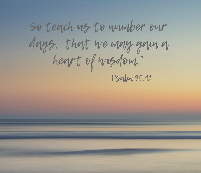
The summer is drawing to a close. I am drifting in the lazy warm days that seem so lethargic that it is easy to let them slip away with nothing accomplished. I am convinced that I ought to be making the most of my time and am squirming under the awareness that I need to get back to the diligence of days that are more focused and productive.

I have begun praying for God’s help and the Holy Spirit brought this particular Scripture to mind. He is so faithful to work on my heart and my thinking. I love how He uses the Word that I have read in the past to work on me now. I’ve been asking for Him to get me off “dead center” where I have been floundering and drifting. Isn’t this a wonderful spiritual “nudge”?!

As a consequence of the busy-ness of the past few months– social commitments, houseguests, garden and home projects– I have not spent much time with my art making. And certainly I have neglected writing for this blog. So, here I am taking myself in hand and trying to pick up where I left off a few months ago.
I have begun practicing two basic alphabets- simple monoline pen practice on grid paper. This focus came about because this summer I was privileged to be the host home for world-famous calligrapher, Barry Morentz. Follow him on Instagram: barrymorentz. He was in my city to lead a calligraphy workshop. His teaching at the workshop and his encouragement as he kindly critiqued several pieces of my work have set me on a new path. He urged me to try my hand at re-doing the pieces he looked over. He also asked me a probing question that really helped me focus. “Which alphabet or alphabets do I most want to master?” That made me realize I first want the ones that are the backbone of all the others. So I began by practicing two basic alphabets- the Roman and the Italic.
I am using graph paper and the “rules” that underlie the basic Roman alphabet to practice proportion. Barry also encouraged me to trace & copy the exemplar of work by Sheila Waters to get the physical feel of doing the italic alphabet right. I have begun doing this and WOW! What a help it is! I urge you to give it a try. Here’s how:
For the Roman alphabet, download this exemplar and practice on grid paper with a pencil and then a monoline (ballpoint, gel tip, etc) pen.
Roman Capital exemplar PDF file – click here!
If you want to focus on Italic calligraphy, photocopy an exemplar from a good calligraphy book, (I suggest Foundations of Calligraphy by Sheila Waters) use your light table as you trace, first with pencil or ballpoint pen, to get the shape and slant in your mind. Then move to using an edged pen of the same size as the exemplar. When you begin using an edged pen and ink be sure to use practice paper that won’t bleed through to your exemplar! I suggest HP Paper, Premium Choice Laserjet Paper Poly Wrap, 32lb, 8.5 x 11, Letter, 500 Sheets / 1 Ream Made In The USA — available on Amazon. This paper is a great basic “drawing” paper that behaves well with ink and works well with markers and light watercolors with minimum buckling and bleed-through.
All this tracing and copying helps you recognize and put into muscle memory the counter shapes, pen angle, slant, spacing and rhythm of the alphabet. This process can be used with any alphabet you want to master.
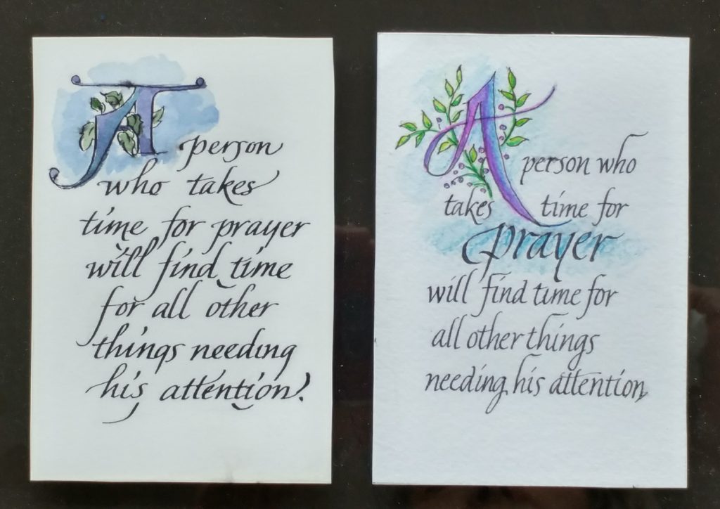
So, now that I have spent a bit of time doing all this, I re-did this little piece of calligraphy that sits on my bathroom counter. What do you think of the improvements in my Italic lettering? I can see several things I still want to do better, but it is very encouraging to see improvement–however small. (I’m not crazy about the colors used in the new version and so think a third shot will happen.)

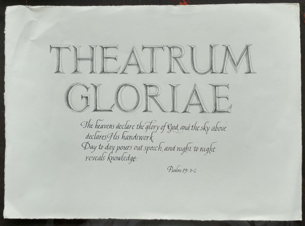
I also have been practicing the Roman alphabet and so tried this piece that combines the two styles of lettering. The Latin Phrase, “Theatrum Gloriae” was used by John Calvin in his famous Institutes of Christian Religion when he was commenting on Psalm 19. The phrase roughly translated means ‘Glorious Theater’ and is a metaphor for the immense beauty of the creation.

Leave me a comment—I’d love to hear your response. And keep on the lookout for the re-do’s of the bigger pieces I mentioned earlier. “Coming Soon”!